AppSuite is an in-house system construction tool that enables inefficient in-house operations that are mainly paper, e-mail, and Excel to be in-house systemized in just 4 steps. From the efficiency of ledger management to the systemization of complex business processes. AppSuite will transform your company into a more work-friendly environment.
* A license must be purchased to use this function.
Application settings screen layout and basic operations
Press the [App Settings] button on the browse screen to display the application setting screen.
Screen Structure
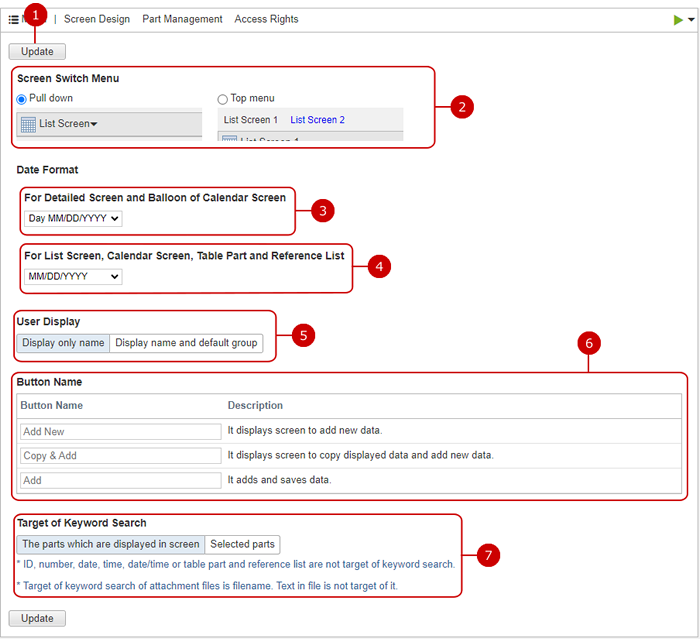
Header Menu
Display Help menu.
Displays the basic information setting screen. (For more information, please refer to: Set basic information)
Delete the application Press [Delete App] to display the confirmation dialog for deleting the application. (For more information, please refer to: Delete the application)
* Please note that deleting the app will delete all the data in the app.
* Please note that deleting the app will delete related application data on workflow.
Displays the screen design setting screen. (For more information, please refer to: Show screen design)
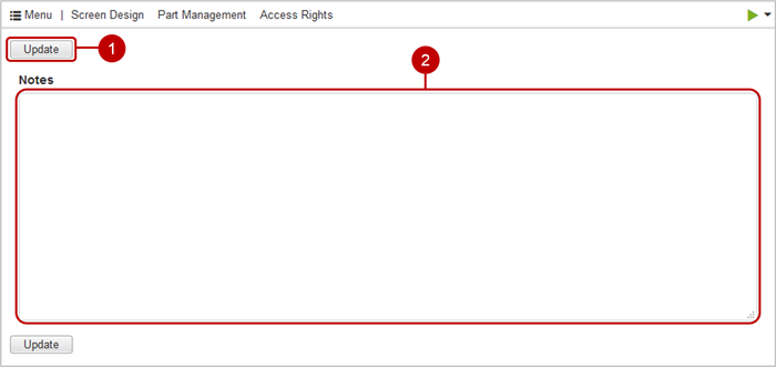
Displays the management memo setting screen. (For more information, please refer to: Set management notes )
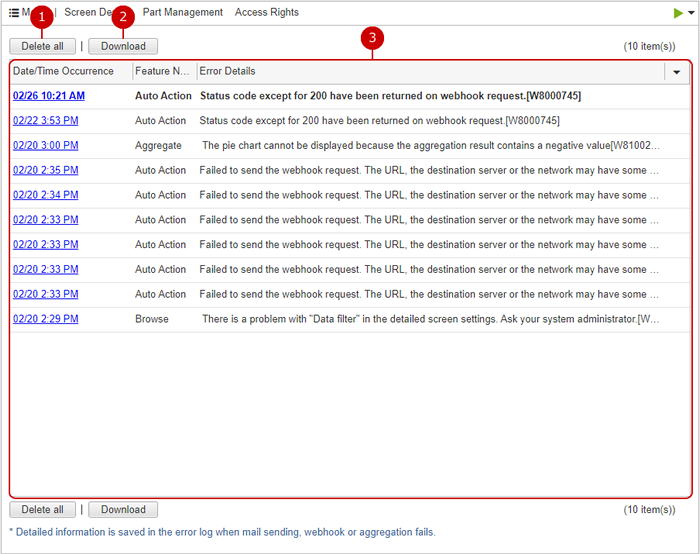
Displays the error log confirmation screen. (For more information, please refer to: Check the error log )
Displays the application form update screen. (Display only in workflow app.)
* you will go to screen of application management of workflow.
Change the status of the application.
Active: Changes the application status to publishing.
Under Maintenance: Change the application status to maintenance.
* If the status is under maintenance, the [Active] button will be displayed. You can change the status to public by clicking the [Active] button.
Disabled: Changes the application status to Stopping.
* Applications with the status "Under Maintenance" or "Disabled" can be referenced, added, changed, deleted, etc. only by the user who has the management authority. * Applications whose status is "Disabled" are displayed only in Application Management.
Set basic information
When you press "Basic Information" of "App" from the header menu, the basic information setting screen is displayed.
Enter the application name.
Enter a description for your application. You can use text decoration and images freely. (For details, see the description of Rich Text Editor Feature in the User's Manual.)
Set the image to the description of the application.
* If you want to delete the file, check the Delete and click the [Update] button.
* The description image can display up to 735 pixels wide and 735 pixels high.
Select an application label. Select the label you want to set for the application from the label list and click the [OK] button.
* You can set the label displayed in the application list.
Set the application icon. A list of icons will be displayed. Select the icon to use.
* If you check Upload image, it will switch to image selection display. Upload the image you want to use for each icon. * Up to 50KB images can be uploaded.
Click "Update" button to save the changes.
Delete the application
If you press "Delete application" of "App" from the header menu, the deletion confirmation dialog is displayed. Select "Delete" in the deletion confirmation dialog and click the [Yes] button to delete the corresponding application. The deleted application cannot be restored. Please take note.
Deletion confirmation dialog when apps are associated
Deletion confirmation dialog of workflow app
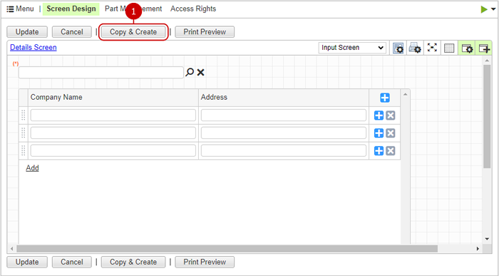
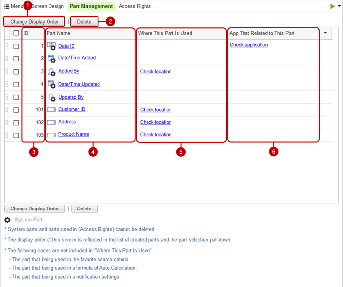
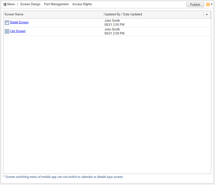
Show screen design
From the header menu, press "Screen design" in "Screen" to display the screen design setting screen. Lists the screens that can be used in the application.
Create the screen. Click the [Create Screen] button to display the create screen dialog.
Change the display order of the selected screen. Select the screen you want to move from the list and press the [Change Display Order] button to switch to the display order change mode. After entering the display order change mode, select the destination of the selected screen. You can select more than one user.
* You can change the display order by holding down the mouse button on the screen you want to move and moving the mouse and releasing the mouse button at any position.
Delete the screen. Select applications from the list and press this button to delete them. You can select more than one setting.
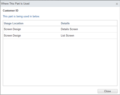
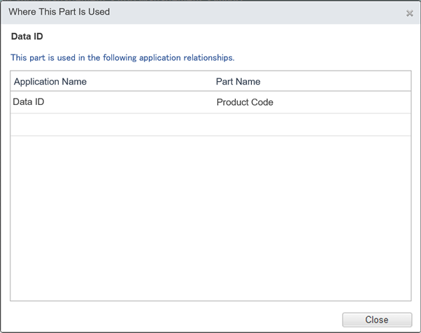
Display a list of screens. When you press the link of the screen name, the screen for changing the screen is displayed. Click the [Settings] link displayed in the screen switching menu to display the detailed screen setting dialog. Click default details screen icon to set the screen as addtion, edit and view screen from list screen, which is displayed as here.
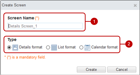
Create screen
Click the [Create screen] button to display the create screen dialog.
Please enter the screen name.
Please select a type
When all input is completed, press the [Create] button. The screen design of the selected type will be displayed.
Detailed format
List format
Calendar format
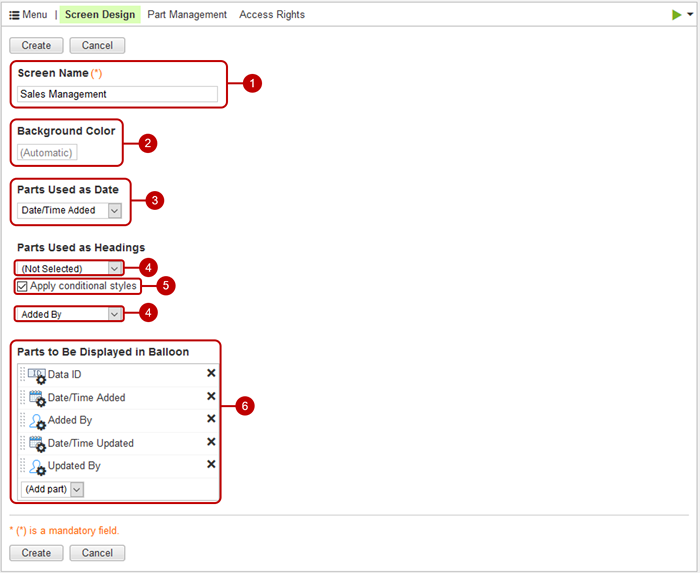
The screen name displayed in the screen switching menu.
The background color of the calendar.
The data is displayed on the calendar in the date of this part or in the square of the date and time value.
It is a part displayed on the calendar.
If checked, the conditional style is applied according to the value of the first part of "Part Use as Headings".
It is a part that is displayed in the speech bubble that is displayed when data is pressed. If the part is not set, the speech bubble will not be displayed and the detailed screen of the corresponding data will be displayed.
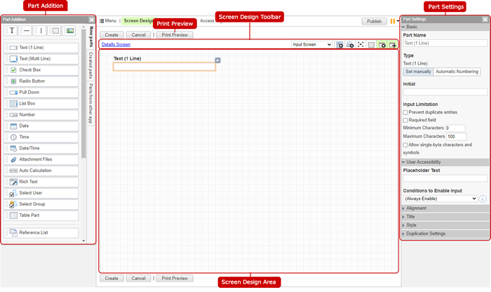
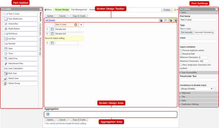
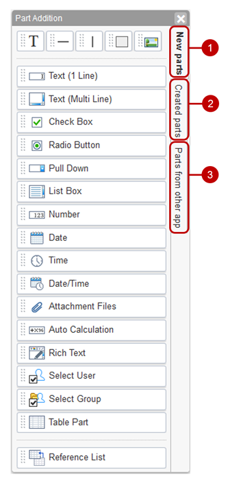
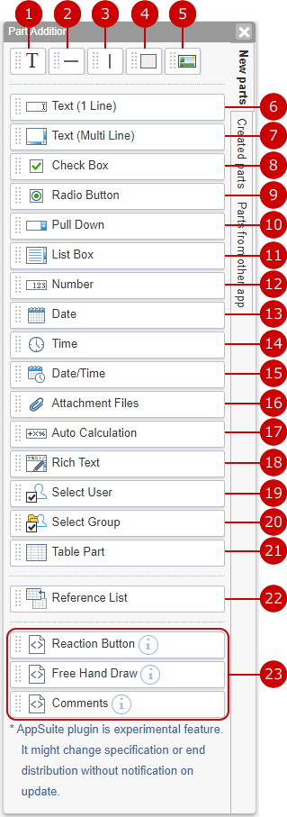
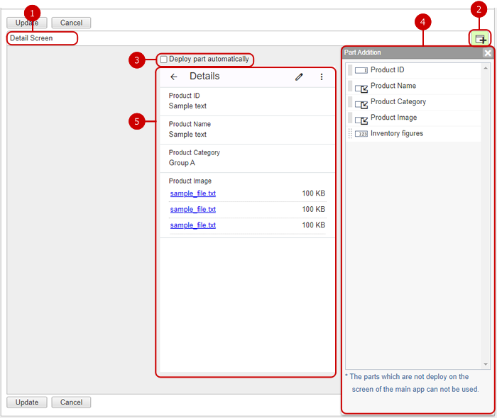
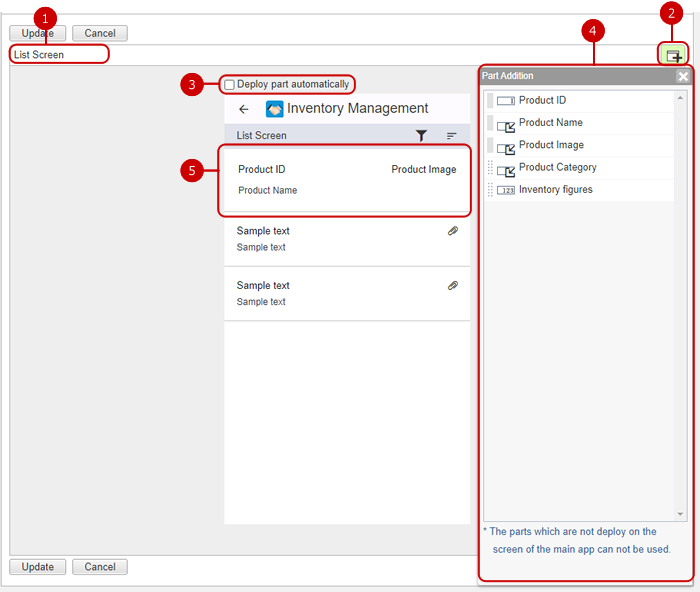
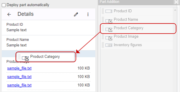
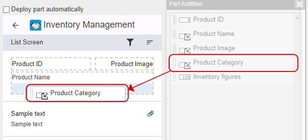
Addition panel for parts
Hold down the mouse button on the part you want to use, move the mouse to the center space, and release the mouse button at any position to place the part.
The new part to be placed on the screen is displayed. (For more information, please refer to: Add a new part )
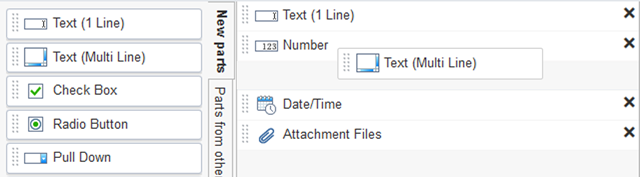
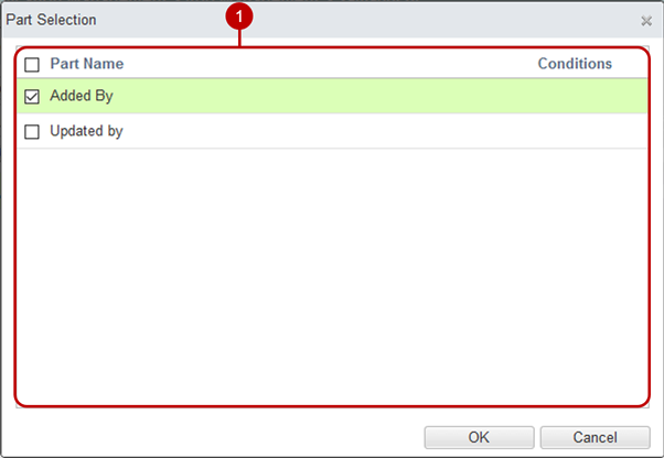
The parts that have already been created and the parts automatically created by the system are displayed. (For more information, please refer to: Add a created part )
Parts created in other related applications are displayed. (For more information, please refer to: Add parts for other applications )
Print preview The screen for printing is displayed in the screen design area. If the paper size is set, it will be displayed on a separate page.
Screen design toolbar related ・Screen type: Detailed format
・Screen type: List format
Change the screen name. You can change the screen name by pressing the screen name link.
You can switch the display of parts in the screen design area between the reference screen and the input screen.
Set the screen display.
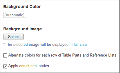
Background color Sets the background color of the screen.
Background image Sets the background image of the screen. The background image is displayed in full size, with the upper left corner as the reference.
Alternate colors for each row Display odd lines in the list with color.
Apply conditional styles Only if checked will the style be applied when its value matches the conditions of the conditional style.
Set the screen print settings.
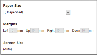
Paper size Adjust the arrangement of parts according to the paper size set when printing.
Margins The margin set here is used as the margin for printing.
Screen size It is the size of the paper excluding the margins. This is the size of the area where parts can be placed per page.
Press the full screen display switching icon to switch to full screen display. When the full screen display switch icon is pressed in the full screen state, the original screen size is restored.
Set the grid. Click the icon to display the grid setting dialog. Select the grid display and spacing, and if you want to snap parts to the grid.
Shows or hides the settings panel for the part.
Shows or hides the add parts panel.
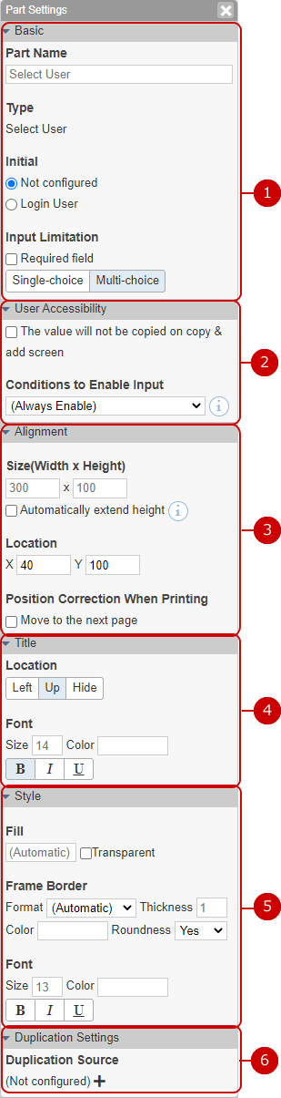
Parts setting panel
This panel allows you to edit the settings of parts. The displayed contents vary depending on the part.
The basic information of the part is displayed.
The settings that help the user are displayed.
The settings related to placement are displayed.
* For list format, you can set only the column width.
The settings related to the part title are displayed.
* Cannot be set for list format.
The settings related to the style of the part are displayed.
The settings for copying data from other applications are displayed.
* To use this function, it must be linked with another application.
Screen design area The placed parts are displayed.
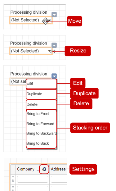
Move, resize, delete parts ・Detailed format
Move
You can move a part by holding down the mouse button on the part you want to move and releasing the mouse button at any position.
Resize
When you place the mouse on the top, bottom, left, right, or the four corners of the part, the mouse cursor changes to an arrow that expands and contracts the part.
Edit
Check Box, Radio Button, Pull-down, List Box: Displays the dialog for changing options.
Auto Calculation: Displays the auto calculation dialog.
Table Part: Displays the table part dialog.
Reference List: Display the reference list dialog.
Duplicate
Copy a part and add a new one.
Delete
When you press a part, the delete icon is displayed in the upper right. When you press the delete icon, the delete confirmation dialog is displayed. Click the [Yes] button in the deletion confirmation dialog to delete the part from the screen.
Stacking order
Change the stacking order of parts.
Settings
Edit the settings with part setting panel. The fields of column of table part is same as the fields of detailed settings of table part. The fields of column of reference list is same as the fields of column of table part, except fields in "Alignment" and "Style" can be edit.
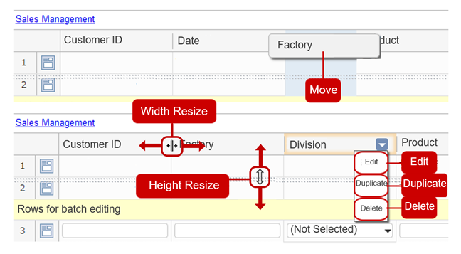
・List format
Move
You can move a part by holding down the mouse button on the part you want to move and releasing the mouse button at any position.
Width Resize
The shape of the mouse pointer changes when the mouse is placed on the border of columns. You can adjust the column width by holding down the mouse button in this state and releasing the mouse button at any position.
Height Resize
The shape of the mouse pointer changes when the mouse is placed between the first and second lines. You can adjust the row height by holding down the mouse button in this state and releasing the mouse button at any position.
Edit
Check Box, Radio Button, Pull-down, List Box: Displays the dialog for changing options.
Auto Calculation: Displays the auto calculation dialog.
Duplicate
Copy a part and add a new one.
Delete
When you press a part, the delete icon is displayed in the upper right. When you press the delete icon, the delete confirmation dialog is displayed. Click the [Yes] button in the deletion confirmation dialog to delete the part from the screen.
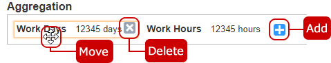
Add, delete, move agregation parts
Add
Click "+" icon and choose part to aggregation to add agregation part.
Move
You can move a part by holding down the mouse button on the part you want to move and releasing the mouse button at any position.
Delete
When you press a part, the delete icon is displayed in the upper right. When you press the delete icon, the delete confirmation dialog is displayed. Click the [Yes] button in the deletion confirmation dialog to delete the part from the screen.
Click "Add" button to save and add the data.
Change screen
When you press the screen name link on the screen design list screen, the screen change screen is displayed.
Displays a new creation screen that duplicates the contents of the screen design you are browsing.
Click "Update" button to save the changes.
Delete screen
Click the [Delete] button on the screen design list screen to display the deletion confirmation dialog. Click the [Yes] button in the deletion confirmation dialog to delete the corresponding screen. The deleted screen cannot be restored. Please take note.
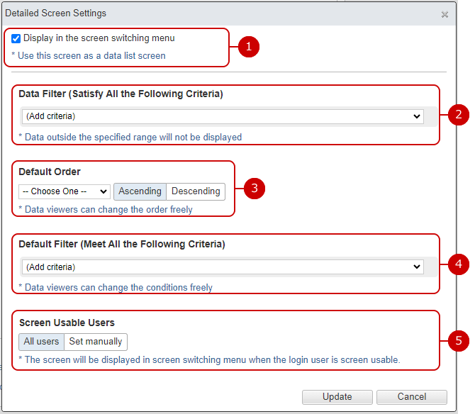
Make detailed screen settings
When you click the [Settings] on the screen design list screen, the detailed screen setting dialog is displayed.
Details Format
Set whether to display in the screen list on the upper left of the browse screen.
Set the conditions for the data displayed on the browse screen.
Set the initial value for the order of the browse screen.
Set the initial value of the narrowing condition of the browse screen. Click the [Advanced Search] link to switch to the advanced search.
Set the screen usable users. The specified users can choose the screen in the screen switching menu.
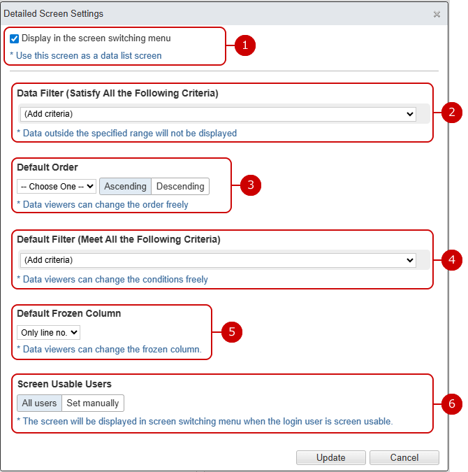
List Format
Set whether to display in the screen list on the upper left of the browse screen.
Set the conditions for the data displayed on the browse screen.
Set the initial value for the order of the browse screen.
Set the initial value of the narrowing condition of the browse screen. Click the [Advanced Search] link to switch to the advanced search.
You can pin the default left column so that it doesn't move when you scroll horizontally. Head to the specified part will be pinned.
Set the screen usable users. The specified users can choose the screen in the screen switching menu.
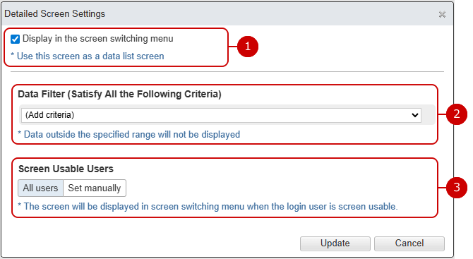
Calendar Format
Set whether to display in the screen list on the upper left of the browse screen.
Set the conditions for the data displayed on the browse screen.
Set the screen usable users. The specified users can choose the screen in the screen switching menu.
Click "Update" button to save the changes.
Add a new part
Add a part to display characters.
Add a part that displays a horizontal line.
Add a part that displays a vertical line.
Add a part that displays a rectangle.
Add the part that displays the image.
Add a part that can input one line of characters.
Add a component that allows you to enter characters on multiple lines.
Add a checkbox part that allows multiple selection from the options.
Add a radio button component that can be selected from only one.
Add a pull-down component that allows you to select only one from a list of choices.
Adds a list box component that allows you to select multiple items from the list format.
Add a part that can input numbers.
Add parts that can be date entered.
Add a part that can input the time.
Add a part that can be input the date and time.
Add a part that can set the attached file.
Adds an auto calculation component that calculates the value entered in the numerical component.
* It is also possible to calculate the parts automatically calculated.
Add reference list. Create a list using the parts created in other related applications. (For more information, please refer to: Detailed settings for reference list )
Add plugin part.
* You can only use the feature if application manager have installed any plugin.
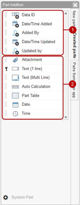
Add a created part
This part is a system part that is automatically created when you create an application.
* The gear icon is attached to the system parts.
Displays the user-created parts. Click a part to select the part.
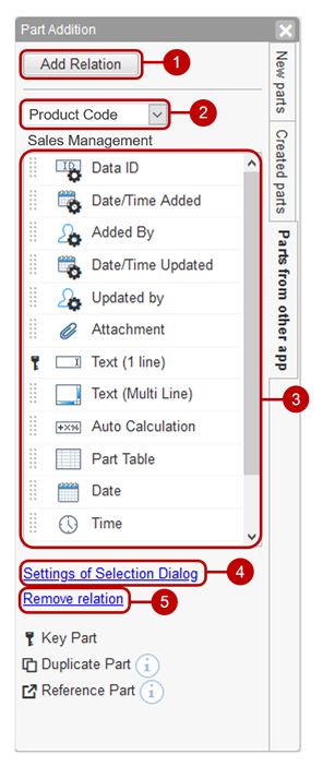
Add parts for other applications
Add a relationship with the application. Click the [Add Relationship] button to display the dialog with other applications. (For more information, please refer to: Add Relationship )
Select the key part. Select from the key components that are associated with other applications. When you switch the key parts, the parts list below changes to that of the application associated with the selected key part.
The parts list of the associated application is displayed.
* For key parts, copy parts, reference parts, etc., dedicated icons are displayed to the left of the part icons.
When you press the setting link in the selection dialog, the dialog related to other applications is displayed. You can change the display parts, arrangement order, filtering conditions, etc. related to other displayed applications. (For more information, please refer to: Add Relationship> Select Dialog Settings )
If you press the link to cancel this relationship, a dialog for confirming the cancellation will be displayed. Click the [Yes] button in the cancellation confirmation dialog to cancel the association with other applications that are displayed. When cancelled, the copied parts remain on the screen but the referenced parts are deleted. Please be careful.
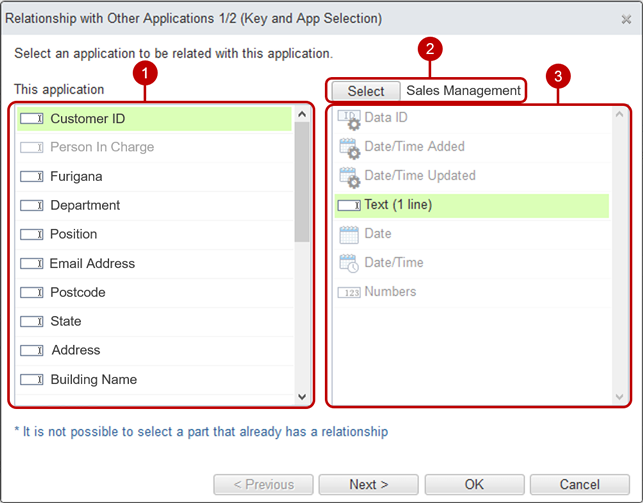
Add Relationship
Key and application selection When you click the [Add Relationship] button of the part of another application, the relationship dialog with other applications is displayed.
Select the key part.
Select the application to associate. Click the [Select] button to display the application selection dialog. (For more information, please refer to: Application selection )
Select the key part.
After the selection is complete, click the [Next] button to display the settings of the selection dialog.
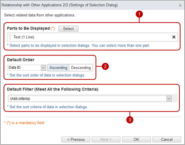
Selection dialog settings
Make settings to select related data from other applications.
Select the parts to be displayed in the dialog for selecting related data from other applications. Click the [Select] button to display the component selection dialog. Check the part name displayed in the list.
Specify the order of the list. Select the part name and the ascending/descending order that will be the basis of the order.
Specify the default filtering condition for the data. Input method is is the basically same as Filter data. Addionally, you can add a condition term to compare with value in input screen.
* When the key part is in any table part, you cannot add a condition term to compare with value in input screen.
When the entry is complete, press "OK" button to save the data.
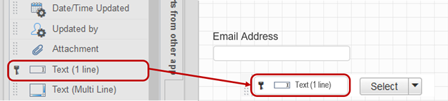
Add copy parts
You can add duplicate parts from "Parts from other app".
* If you drag and drop a radio button part, a Text (1 Line) part is created instead of the radio button part. * If you drag and drop a pull-down component, a Text (1 Line) component will be created instead of the pull-down component.
Hold down the mouse button on the part, move the mouse to the screen design area, and release the mouse button at any position.
Select "Copy Parts" from the menu.
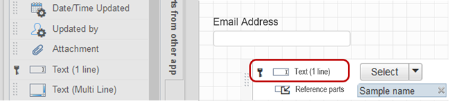
Add reference parts
You can add reference parts from "Parts from other app".
Hold down the mouse button on the part, move the mouse to the screen design area, and release the mouse button at any position.
Select "Reference Parts" from the menu.
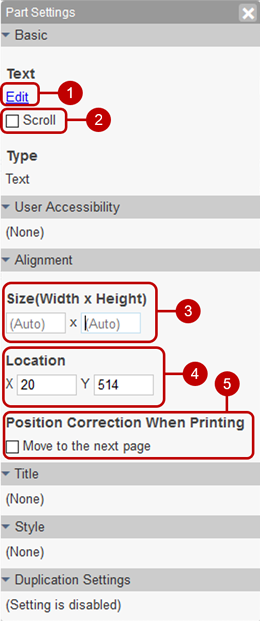
Text part settings
It is used when displaying sentences. You can freely use text decorations and images.
Edit the text to be displayed. Pressing the edit link will bring up the rich text editor dialog. (For details, see the description of Rich Text Editor Feature in the User's Manual.)
If the text exceeds the size of the part (width x height), a scroll bar will be displayed automatically.
Set the width and height of the part.
Set the coordinates (x axis, y axis) of the part.
If parts are likely to be placed across pages when printing, correct them so that they are placed at the beginning of the next page.
If the paper size is not set on the screen, it will not be corrected.
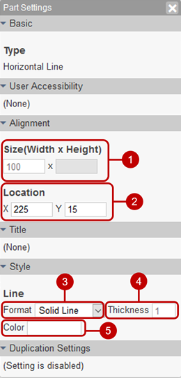
Horizontal line part setting
A horizontal line used for separation is displayed.
Set the width of the part.
Set the coordinates (x axis, y axis) of the part.
Choose a dash type of the line. Select from solid line, broken line, and dotted line.
Enter the line thickness.
Choose the color. You can select from 60 colors. You can also enter the RGB value in hexadecimal.
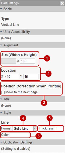
Vertical line part setting
A vertical line used for separation is displayed.
Set the height of the part.
Set the coordinates (x axis, y axis) of the part.
If parts are likely to be placed across pages when printing, correct them so that they are placed at the beginning of the next page.
If the paper size is not set on the screen, it will not be corrected.
Choose a dash type of the line. Select from solid line, broken line, and dotted line.
Enter the line thickness.
Choose the color. You can select from 60 colors. You can also enter the RGB value in hexadecimal.
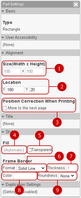
Rectangle part setting
Display a rectangle.
Set the width and height of the part.
Set the coordinates (x axis, y axis) of the part.
If parts are likely to be placed across pages when printing, correct them so that they are placed at the beginning of the next page.
If the paper size is not set on the screen, it will not be corrected.
Select the inner color of the rectangle. You can select from 60 colors. You can also enter the RGB value in hexadecimal.
Makes the interior color of the rectangle transparent.
Choose a dash type of the line. Select from None, Solid line, Dashed line, Dotted line.
Enter the line thickness.
Select a line color. You can select from 60 colors. You can also enter the RGB value in hexadecimal.
Select the rounded corners. Select from No or Yes.
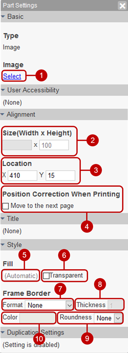
Image part settings
Display the image.
Select the file you want to view.
Set the width and height of the part.
Set the coordinates (x axis, y axis) of the part.
If parts are likely to be placed across pages when printing, correct them so that they are placed at the beginning of the next page.
If the paper size is not set on the screen, it will not be corrected.
Select the internal color of the image. You can select from 60 colors. You can also enter the RGB value in hexadecimal.
Makes the internal color of the image transparent.
Choose a dash type of the line. Select from None, Solid line, Dashed line, Dotted line.
Enter the line thickness.
Select a line color. You can select from 60 colors. You can also enter the RGB value in hexadecimal.
Select the rounded corners. Select from No or Yes.
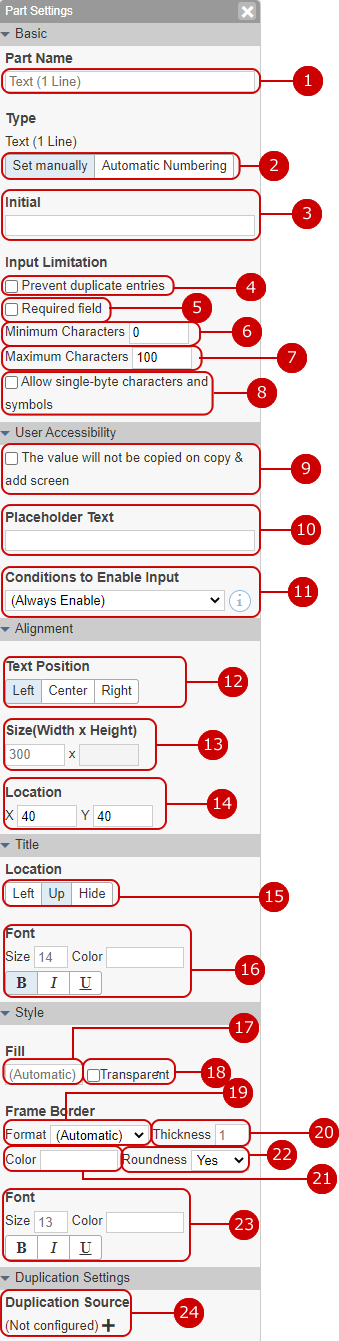
Text (1 Line) part setting
Used for items to be entered.
Enter the part name.
Select the character type from "Set manually" or "Automatic Numbering". (For more information, please refer to: Set automatic numbering )
Enter a text displayed as the initial text.
Set to prohibit duplicate values.
Check if this field is a mandatory field. If you set it as a required item, * mark will be displayed.
Enter the minimum number of characters.
Enter the maximum number of characters.
Only single-byte alphanumeric characters and symbols can be entered.
Check it not to duplicated the value of source data initially on the copy & add screen.
Set the placeholder text to be displayed in the input field.
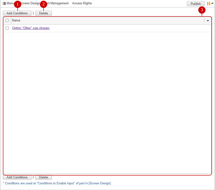
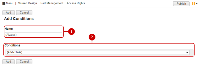
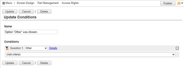
Only when the value matches the specified condition, the part can be inputed.
On such state, its value will not be saved when the data have been added/updated.
* You should add condition in [Conditions] before.
* If a changed value have been disabled, it will not be saved.
* When the data have been added/updated on following, this setting will be ignored.
Import from Excel/CSV File
Auto Action
AppSuite API
Select the position to display characters from "Left Alignment", "Center Alignment", and "Right Alignment".
Set the width of the part.
Set the coordinates (x axis, y axis) of the part.
Select the position to display the part name from "Left" "Up" "Hide".
The character of the part name is decorated. Size: Enter the size of the text.
* You cannot set a value of 7 or less and a value of 73 or more for the character size.
Color: You can select from 60 colors. You can also enter the RGB value in hexadecimal. Style: You can set “bold”, “italic”, and “underline”.
Select the internal color of the part. You can select from 60 colors. You can also enter the RGB value in hexadecimal.
Makes the internal color of the part transparent.
Choose a dash type of the line. Select from Auto, None, Solid line, Dashed line, Dotted line.
Enter the line thickness.
Select a line color. You can select from 60 colors. You can also enter the RGB value in hexadecimal.
Select the rounded corners. Select from No or Yes.
The character is decorated. Size: Enter the size of the text.
* You cannot set a value of 7 or less and a value of 73 or more for the character size.
Color: You can select from 60 colors. You can also enter the RGB value in hexadecimal. Style: You can set “bold”, “italic”, and “underline”.
Make settings for copying data from other applications. Select the key part and the copy source part.
* To use this function, it must be linked with another application.
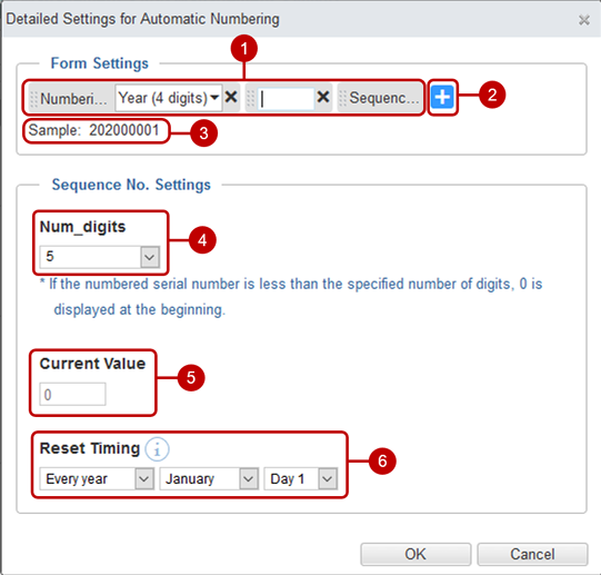
Set automatic numbering
Set automatic numbering. Automatic numbering can be set in the part settings for Text (1 Line) parts. Only one part per application can enable the automatic numbering setting.
Set the format of automatic numbering.
* You can change the format by dragging and dropping.
Select the parts to be used in the automatic numbering format. In addition to (arbitrary character string) and numbering date, you can select parts of type (Text (1 Line)), Number, Date, Time, Date/Time, Radio Button, Pull Down.
A sample that reflects the settings is displayed.
Select the number of digits in the serial number. (Not specified) Select from 2-9
* If the numbered serial number is less than the specified number of digits, 0 is displayed at the beginning.
Enter the current value of the serial number. The value of "current value" + 1 is assigned.
Select the reset timing.
(Do not reset): Do not reset the serial number to 0.
* The numbering date in the format setting will be replaced with the date when the data was registered.
Every year: The "current value" of the serial number is reset to 0 on the specified day every year.
* The numbering date in the format setting will be replaced with the year or year in which the data was registered. * Reset will be performed after midnight.
Monthly: The "current value" of the serial number is reset to 0 on the specified day every month.
* The numbering date in the format setting will be replaced with the month or month when the data was registered. * Reset will be performed after midnight.
Every day: The "current value" of the serial number is reset to 0 every day.
* The numbering date in the format setting will be replaced with the date when the data was registered. * Reset will be performed after midnight.
When the setup is complete, press "OK" button to save the data.
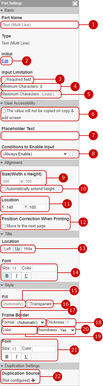
Text (Multi Line) component settings
It is used for items that require you to enter a multi-line sentence.
Enter the part name.
Enter a text displayed as the initial text.
Check if this field is a mandatory field. If you set it as a required item, * mark will be displayed.
Enter the minimum number of characters.
Enter the maximum number of characters.
Check it not to duplicated the value of source data initially on the copy & add screen.
Set the placeholder text to be displayed in the input field.
Only when the value matches the specified condition, the part can be inputed.
On such state, its value will not be saved when the data have been added/updated.
* You should add condition in [Conditions] before.
* If a changed value have been disabled, it will not be saved.
* When the data have been added/updated on following, this setting will be ignored.
Import from Excel/CSV File
Auto Action
AppSuite API
Set the width and height of the part.
The height of parts is automatically expanded and contracted. If set, the data will automatically expand and contract so that the data will not be cut off on the reference screen.
Set the coordinates (x axis, y axis) of the part.
If parts are likely to be placed across pages when printing, correct them so that they are placed at the beginning of the next page.
If the paper size is not set on the screen, it will not be corrected.
Select the position to display the part name from "Left" "Up" "Hide".
The character of the part name is decorated. Size: Enter the size of the text.
* You cannot set a value of 7 or less and a value of 73 or more for the character size.
Color: You can select from 60 colors. You can also enter the RGB value in hexadecimal. Style: You can set “bold”, “italic”, and “underline”.
Select the internal color of the part. You can select from 60 colors. You can also enter the RGB value in hexadecimal.
Makes the internal color of the part transparent.
Choose a dash type of the line. Select from Auto, None, Solid line, Dashed line, Dotted line.
Enter the line thickness.
Select a line color. You can select from 60 colors. You can also enter the RGB value in hexadecimal.
Select the rounded corners. Select from No or Yes.
The character is decorated. Size: Enter the size of the text.
* You cannot set a value of 7 or less and a value of 73 or more for the character size.
Color: You can select from 60 colors. You can also enter the RGB value in hexadecimal. Style: You can set “bold”, “italic”, and “underline”.
Make settings for copying data from other applications. Select the key part and the copy source part.
* To use this function, it must be linked with another application.
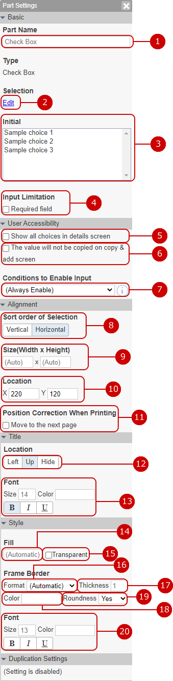
Check box component settings
It is used to select multiple items from the options.
Enter the part name.
Enter your choices. When you press the edit link, the dialog for changing options is displayed.
Check it to be able to input a free text not in the selections as "Other".
Select the initial value.
Check if this field is a mandatory field. If you set it as a required item, * mark will be displayed.
Set whether to display all options on the reference screen. When set to "Show all choices on reference screen", all choices are displayed on the reference screen as well as the change screen.
Check it not to duplicated the value of source data initially on the copy & add screen.
Only when the value matches the specified condition, the part can be inputed.
On such state, its value will not be saved when the data have been added/updated.
* You should add condition in [Conditions] before.
* If a changed value have beed disabled, it will not be saved.
* When the data have been added/updated on following, this setting will be ignored.
Import from Excel/CSV File
Auto Action
AppSuite API
Select the order in which the options are displayed from "Vertical" or "Horizontal".
Set the width and height of the part.
Set the coordinates (x axis, y axis) of the part.
If parts are likely to be placed across pages when printing, correct them so that they are placed at the beginning of the next page.
If the paper size is not set on the screen, it will not be corrected.
Select the position to display the part name from "Left" "Up" "Hide".
The character of the part name is decorated. Size: Enter the size of the text.
* You cannot set a value of 7 or less and a value of 73 or more for the character size.
Color: You can select from 60 colors. You can also enter the RGB value in hexadecimal. Style: You can set “bold”, “italic”, and “underline”.
Select the internal color of the part. You can select from 60 colors. You can also enter the RGB value in hexadecimal.
Makes the internal color of the part transparent.
Choose a dash type of the line. Select from Auto, None, Solid line, Dashed line, Dotted line.
Enter the line thickness.
Select a line color. You can select from 60 colors. You can also enter the RGB value in hexadecimal.
Select the rounded corners. Select from No or Yes.
The character is decorated. Size: Enter the size of the text.
* You cannot set a value of 7 or less and a value of 73 or more for the character size.
Color: You can select from 60 colors. You can also enter the RGB value in hexadecimal. Style: You can set “bold”, “italic”, and “underline”.
Enter the width of the "Other" field.
This can be entered if "Allow to input value not in selections" is checked.
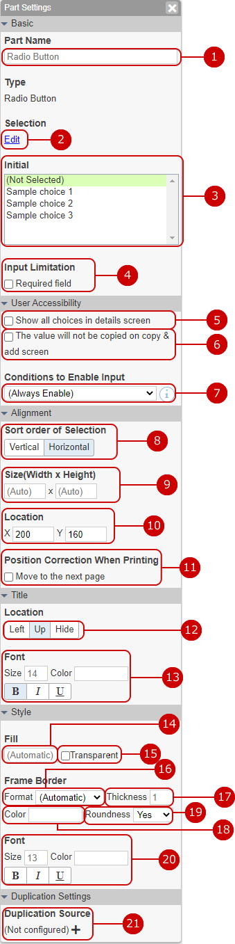
Radio button component settings
Use this control to choose one item.
Enter the part name.
Enter your choices. When you press the edit link, the dialog for changing options is displayed.
Check it to be able to input a free text not in the selections as "Other".
Select the initial value.
Check if this field is a mandatory field. If you set it as a required item, * mark will be displayed.
Set whether to display all options on the reference screen. When set to "Show all choices on reference screen", all choices are displayed on the reference screen as well as the change screen.
Check it not to duplicated the value of source data initially on the copy & add screen.
Only when the value matches the specified condition, the part can be inputed.
On such state, its value will not be saved when the data have been added/updated.
* You should add condition in [Conditions] before.
* If a changed value have beed disabled, it will not be saved.
* When the data have been added/updated on following, this setting will be ignored.
Import from Excel/CSV File
Auto Action
AppSuite API
Select the order in which the options are displayed from "Vertical" or "Horizontal".
Set the width and height of the part.
Set the coordinates (x axis, y axis) of the part.
If parts are likely to be placed across pages when printing, correct them so that they are placed at the beginning of the next page.
If the paper size is not set on the screen, it will not be corrected.
Select the position to display the part name from "Left" "Up" "Hide".
The character of the part name is decorated. Size: Enter the size of the text.
* You cannot set a value of 7 or less and a value of 73 or more for the character size.
Color: You can select from 60 colors. You can also enter the RGB value in hexadecimal. Style: You can set “bold”, “italic”, and “underline”.
Select the internal color of the part. You can select from 60 colors. You can also enter the RGB value in hexadecimal.
Makes the internal color of the part transparent.
Choose a dash type of the line. Select from Auto, None, Solid line, Dashed line, Dotted line.
Enter the line thickness.
Select a line color. You can select from 60 colors. You can also enter the RGB value in hexadecimal.
Select the rounded corners. Select from No or Yes.
The character is decorated. Size: Enter the size of the text.
* You cannot set a value of 7 or less and a value of 73 or more for the character size.
Color: You can select from 60 colors. You can also enter the RGB value in hexadecimal. Style: You can set “bold”, “italic”, and “underline”.
Enter the width of the "Other" field.
This can be entered if "Allow to input value not in selections" is checked.
Make settings for copying data from other applications. Select the key part and the copy source part.
* To use this function, it must be linked with another application.
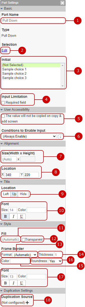
Pull-down component settings
It is used to select one from the items displayed in one line.
Enter the part name.
Enter your choices. When you press the edit link, the dialog for changing options is displayed.
Select the initial value.
Check if this field is a mandatory field. If you set it as a required item, * mark will be displayed.
Check it not to duplicated the value of source data initially on the copy & add screen.
Only when the value matches the specified condition, the part can be inputed.
On such state, its value will not be saved when the data have been added/updated.
* You should add condition in [Conditions] before.
* If a changed value have beed disabled, it will not be saved.
* When the data have been added/updated on following, this setting will be ignored.
Import from Excel/CSV File
Auto Action
AppSuite API
Set the width of the part.
Set the coordinates (x axis, y axis) of the part.
Select the position to display the part name from "Left" "Up" "Hide".
The character of the part name is decorated. Size: Enter the size of the text.
* You cannot set a value of 7 or less and a value of 73 or more for the character size.
Color: You can select from 60 colors. You can also enter the RGB value in hexadecimal. Style: You can set “bold”, “italic”, and “underline”.
Select the internal color of the part. You can select from 60 colors. You can also enter the RGB value in hexadecimal.
Makes the internal color of the part transparent.
Choose a dash type of the line. Select from Auto, None, Solid line, Dashed line, Dotted line.
Enter the line thickness.
Select a line color. You can select from 60 colors. You can also enter the RGB value in hexadecimal.
Select the rounded corners. Select from No or Yes.
The character is decorated. Size: Enter the size of the text.
* You cannot set a value of 7 or less and a value of 73 or more for the character size.
Color: You can select from 60 colors. You can also enter the RGB value in hexadecimal. Style: You can set “bold”, “italic”, and “underline”.
Make settings for copying data from other applications. Select the key part and the copy source part.
* To use this function, it must be linked with another application.
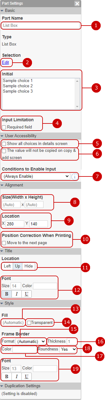
List box component settings
Used when selecting multiple items from the list box display.
Enter the part name.
Enter your choices. When you press the edit link, the dialog for changing options is displayed.
Select the initial value.
Check if this field is a mandatory field. If you set it as a required item, * mark will be displayed.
Set whether to display all options on the reference screen. When set to "Show all choices on reference screen", all choices are displayed on the reference screen as well as the change screen.
Check it not to duplicated the value of source data initially on the copy & add screen.
Only when the value matches the specified condition, the part can be inputed.
On such state, its value will not be saved when the data have been added/updated.
* You should add condition in [Conditions] before.
* If a changed value have beed disabled, it will not be saved.
* When the data have been added/updated on following, this setting will be ignored.
Import from Excel/CSV File
Auto Action
AppSuite API
Set the width and height of the part.
Set the coordinates (x axis, y axis) of the part.
If parts are likely to be placed across pages when printing, correct them so that they are placed at the beginning of the next page.
If the paper size is not set on the screen, it will not be corrected.
Select the position to display the part name from "Left" "Up" "Hide".
The character of the part name is decorated. Size: Enter the size of the text.
* You cannot set a value of 7 or less and a value of 73 or more for the character size.
Color: You can select from 60 colors. You can also enter the RGB value in hexadecimal. Style: You can set “bold”, “italic”, and “underline”.
Select the internal color of the part. You can select from 60 colors. You can also enter the RGB value in hexadecimal.
Makes the internal color of the part transparent.
Choose a dash type of the line. Select from Auto, None, Solid line, Dashed line, Dotted line.
Enter the line thickness.
Select a line color. You can select from 60 colors. You can also enter the RGB value in hexadecimal.
Select the rounded corners. Select from No or Yes.
The character is decorated. Size: Enter the size of the text.
* You cannot set a value of 7 or less and a value of 73 or more for the character size.
Color: You can select from 60 colors. You can also enter the RGB value in hexadecimal. Style: You can set “bold”, “italic”, and “underline”.
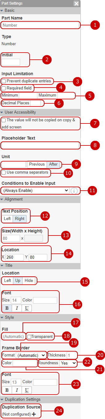
Number part setting
The control can be used to enter number such as amount, quantity.
* Number parts can also be aggregated by combining them with automatically calculated parts.
Enter the part name.
Enter a text displayed as the initial text.
Set to prohibit duplicate values.
Check if this field is a mandatory field. If you set it as a required item, * mark will be displayed.
Enter the minimum and maximum values.
Enter the number of decimal places.
Check it not to duplicated the value of source data initially on the copy & add screen.
Set the placeholder text to be displayed in the input field.
Specify the unit of the number. Displays the characters entered before or after the number.
Set the digit separator (,) to the number.
Only when the value matches the specified condition, the part can be inputed.
On such state, its value will not be saved when the data have been added/updated.
* You should add condition in [Conditions] before.
* If a changed value have beed disabled, it will not be saved.
* When the data have been added/updated on following, this setting will be ignored.
Import from Excel/CSV File
Auto Action
AppSuite API
Select the position to display the character from "Left Alignment" or "Right Alignment".
Set the width of the part.
Set the coordinates (x axis, y axis) of the part.
Select the position to display the part name from "Left" "Up" "Hide".
The character of the part name is decorated. Size: Enter the size of the text.
* You cannot set a value of 7 or less and a value of 73 or more for the character size.
Color: You can select from 60 colors. You can also enter the RGB value in hexadecimal. Style: You can set “bold”, “italic”, and “underline”.
Select the internal color of the part. You can select from 60 colors. You can also enter the RGB value in hexadecimal.
Makes the internal color of the part transparent.
Choose a dash type of the line. Select from Auto, None, Solid line, Dashed line, Dotted line.
Enter the line thickness.
Select a line color. You can select from 60 colors. You can also enter the RGB value in hexadecimal.
Select the rounded corners. Select from No or Yes.
The character is decorated. Size: Enter the size of the text.
* You cannot set a value of 7 or less and a value of 73 or more for the character size.
Color: You can select from 60 colors. You can also enter the RGB value in hexadecimal. Style: You can set “bold”, “italic”, and “underline”.
Make settings for copying data from other applications. Select the key part and the copy source part.
* To use this function, it must be linked with another application.
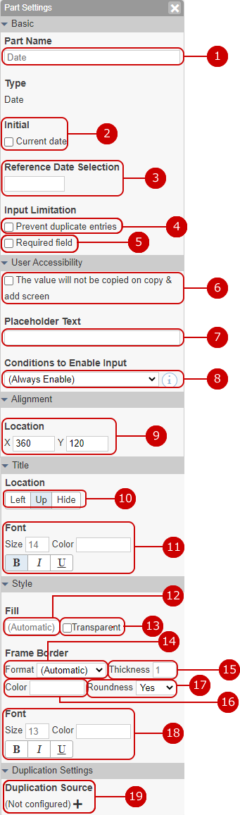
Date part setting
The control can be used to enter a date.
Enter the part name.
Set the current date as the initial value in the input field.
Set the initial date when the date selection calendar is displayed with no date entered.
Set to prohibit duplicate values.
Check if this field is a mandatory field. If you set it as a required item, * mark will be displayed.
Check it not to duplicated the value of source data initially on the copy & add screen.
Set the placeholder text to be displayed in the input field.
Only when the value matches the specified condition, the part can be inputed.
On such state, its value will not be saved when the data have been added/updated.
* You should add condition in [Conditions] before.
* If a changed value have beed disabled, it will not be saved.
* When the data have been added/updated on following, this setting will be ignored.
Import from Excel/CSV File
Auto Action
AppSuite API
Set the coordinates (x axis, y axis) of the part.
Select the position to display the part name from "Left" "Up" "Hide".
The character of the part name is decorated. Size: Enter the size of the text.
* You cannot set a value of 7 or less and a value of 73 or more for the character size.
Color: You can select from 60 colors. You can also enter the RGB value in hexadecimal. Style: You can set “bold”, “italic”, and “underline”.
Select the internal color of the part. You can select from 60 colors. You can also enter the RGB value in hexadecimal.
Makes the internal color of the part transparent.
Choose a dash type of the line. Select from Auto, None, Solid line, Dashed line, Dotted line.
Enter the line thickness.
Select a line color. You can select from 60 colors. You can also enter the RGB value in hexadecimal.
Select the rounded corners. Select from No or Yes.
The character is decorated. Size: Enter the size of the text.
* You cannot set a value of 7 or less and a value of 73 or more for the character size.
Color: You can select from 60 colors. You can also enter the RGB value in hexadecimal. Style: You can set “bold”, “italic”, and “underline”.
Make settings for copying data from other applications. Select the key part and the copy source part.
* To use this function, it must be linked with another application.
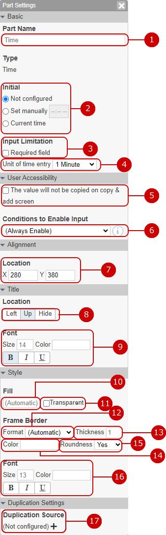
Time component setting
It can be used for items to enter the time.
Enter the part name.
Set the initial value in the input field. Select from unset, any value, and current time.
Check if this field is a mandatory field. If you set it as a required item, * mark will be displayed.
Set the unit of minute on input.
Check it not to duplicated the value of source data initially on the copy & add screen.
Only when the value matches the specified condition, the part can be inputed.
On such state, its value will not be saved when the data have been added/updated.
* You should add condition in [Conditions] before.
* If a changed value have beed disabled, it will not be saved.
* When the data have been added/updated on following, this setting will be ignored.
Import from Excel/CSV File
Auto Action
AppSuite API
Set the coordinates (x axis, y axis) of the part.
Select the position to display the part name from "Left" "Up" "Hide".
The character of the part name is decorated. Size: Enter the size of the text.
* You cannot set a value of 7 or less and a value of 73 or more for the character size.
Color: You can select from 60 colors. You can also enter the RGB value in hexadecimal. Style: You can set “bold”, “italic”, and “underline”.
Select the internal color of the part. You can select from 60 colors. You can also enter the RGB value in hexadecimal.
Makes the internal color of the part transparent.
Choose a dash type of the line. Select from Auto, None, Solid line, Dashed line, Dotted line.
Enter the line thickness.
Select a line color. You can select from 60 colors. You can also enter the RGB value in hexadecimal.
Select the rounded corners. Select from No or Yes.
The character is decorated. Size: Enter the size of the text.
* You cannot set a value of 7 or less and a value of 73 or more for the character size.
Color: You can select from 60 colors. You can also enter the RGB value in hexadecimal. Style: You can set “bold”, “italic”, and “underline”.
Make settings for copying data from other applications. Select the key part and the copy source part.
* To use this function, it must be linked with another application.
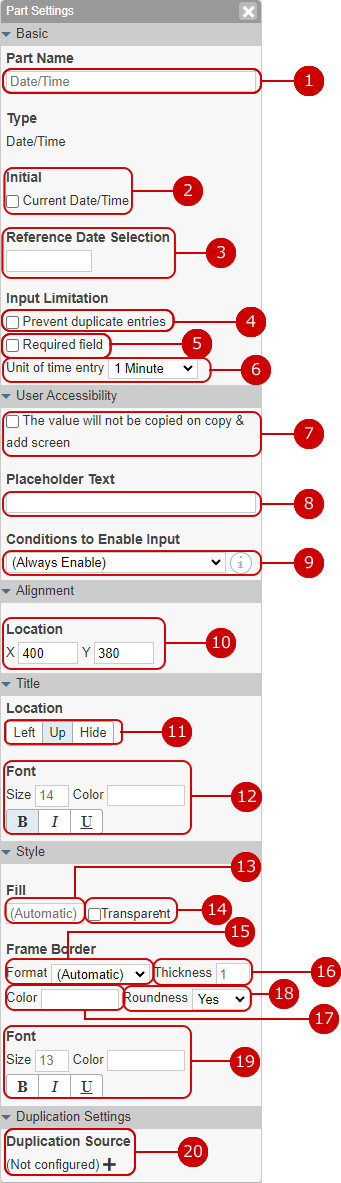
Date/Time component settings
It can be used for items to enter the date and time.
Enter the part name.
Set the current date and time as the initial value in the input field.
Set the initial date when the date selection calendar is displayed with no date entered.
Set to prohibit duplicate values.
Check if this field is a mandatory field. If you set it as a required item, * mark will be displayed.
Set the unit of minute on input.
Check it not to duplicated the value of source data initially on the copy & add screen.
Set the placeholder text to be displayed in the input field.
Only when the value matches the specified condition, the part can be inputed.
On such state, its value will not be saved when the data have been added/updated.
* You should add condition in [Conditions] before.
* If a changed value have beed disabled, it will not be saved.
* When the data have been added/updated on following, this setting will be ignored.
Import from Excel/CSV File
Auto Action
AppSuite API
Set the coordinates (x axis, y axis) of the part.
Select the position to display the part name from "Left" "Up" "Hide".
The character of the part name is decorated. Size: Enter the size of the text.
* You cannot set a value of 7 or less and a value of 73 or more for the character size.
Color: You can select from 60 colors. You can also enter the RGB value in hexadecimal. Style: You can set “bold”, “italic”, and “underline”.
Select the internal color of the part. You can select from 60 colors. You can also enter the RGB value in hexadecimal.
Makes the internal color of the part transparent.
Choose a dash type of the line. Select from Auto, None, Solid line, Dashed line, Dotted line.
Enter the line thickness.
Select a line color. You can select from 60 colors. You can also enter the RGB value in hexadecimal.
Select the rounded corners. Select from No or Yes.
The character is decorated. Size: Enter the size of the text.
* You cannot set a value of 7 or less and a value of 73 or more for the character size.
Color: You can select from 60 colors. You can also enter the RGB value in hexadecimal. Style: You can set “bold”, “italic”, and “underline”.
Make settings for copying data from other applications. Select the key part and the copy source part.
* To use this function, it must be linked with another application.
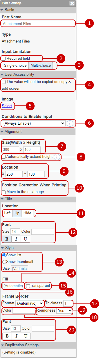
Attachment part settings
You can paste the file as an attachment and send it.
Enter the part name.
Check if this field is a mandatory field. If you set it as a required item, * mark will be displayed.
Select the file that can be pasted from "Single-choice" and "Multi-choice".
Check it not to duplicated the value of source data initially on the copy & add screen.
Select an alternative image.
Only when the value matches the specified condition, the part can be inputed.
On such state, its value will not be saved when the data have been added/updated.
* You should add condition in [Conditions] before.
* If a changed value have beed disabled, it will not be saved.
* When the data have been added/updated on following, this setting will be ignored.
Import from Excel/CSV File
Auto Action
AppSuite API
Set the width and height of the part.
The height of parts is automatically expanded and contracted. If set, the data will automatically expand and contract so that the data will not be cut off on the reference screen.
Set the coordinates (x axis, y axis) of the part.
If parts are likely to be placed across pages when printing, correct them so that they are placed at the beginning of the next page.
If the paper size is not set on the screen, it will not be corrected.
Select the position to display the part name from "Left" "Up" "Hide".
The character of the part name is decorated. Size: Enter the size of the text.
* You cannot set a value of 7 or less and a value of 73 or more for the character size.
Color: You can select from 60 colors. You can also enter the RGB value in hexadecimal. Style: You can set “bold”, “italic”, and “underline”.
Select how to display the attached file. Select from "Display as a list", "Display thumbnails", or "Display only presence or absence of file". Enter size of thumbnail to fix its size.
* "Display only file" can be selected only on the list screen.
Select the internal color of the part. You can select from 60 colors. You can also enter the RGB value in hexadecimal.
Makes the internal color of the part transparent.
Choose a dash type of the line. Select from Auto, None, Solid line, Dashed line, Dotted line.
Enter the line thickness.
Select a line color. You can select from 60 colors. You can also enter the RGB value in hexadecimal.
Select the rounded corners. Select from No or Yes.
The character is decorated. Size: Enter the size of the text.
* You cannot set a value of 7 or less and a value of 73 or more for the character size.
Color: You can select from 60 colors. You can also enter the RGB value in hexadecimal. Style: You can set “bold”, “italic”, and “underline”.
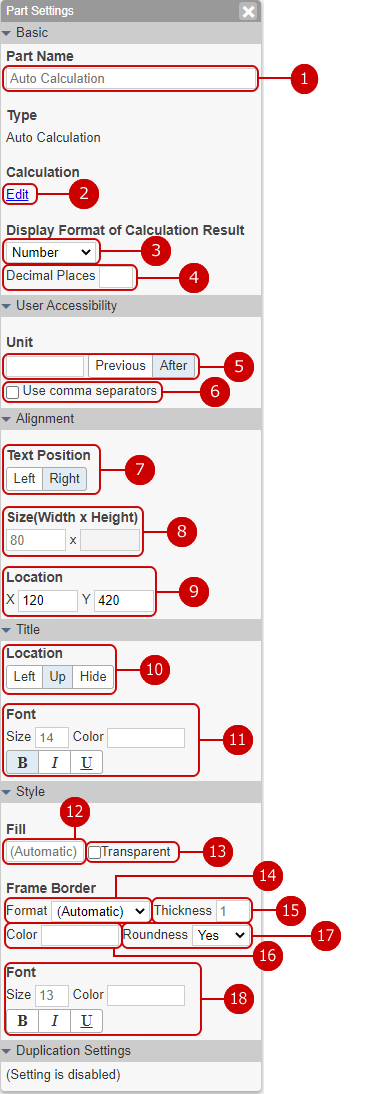
Auto calculation parts setting
Numerical values entered in Number parts can be calculated or summed up and displayed. Since the calculated result can be selected as the calculation target of another auto calculation component, it is possible to combine multiple arithmetic operations.
Enter the part name.
Enter the calculation formula. When you press the edit link, the auto calculation dialog is displayed. (For more information, please refer to: Set calculation formula for auto calculation )
Select the display format of the calculation result.
Character: Display the calculation result as it is.
Number: The display changes according to the setting of "Unit" and "Use digit grouping (,) in reference screen".
Date: Displays the date when the calculated number of seconds has passed since January 1, 1970.
Date/Time: Displays the date and time (in local time) when the calculated number of seconds has elapsed since 00:00 on January 1, 1970 Coordinated Universal Time.
Time: Displays the number of hours and minutes when the calculation result is in seconds.
* If it is not a letter, the letter or error is displayed in gray.
Enter the number of decimal places.
Specify the unit of the number. Displays the characters entered before or after the number.
Set the digit separator (,) to the number.
Select the position to display the character from "Left Alignment" or "Right Alignment".
Set the width of the part.
Set the coordinates (x axis, y axis) of the part.
Select the position to display the part name from "Left" "Up" "Hide".
The character of the part name is decorated. Size: Enter the size of the text.
* You cannot set a value of 7 or less and a value of 73 or more for the character size.
Color: You can select from 60 colors. You can also enter the RGB value in hexadecimal. Style: You can set “bold”, “italic”, and “underline”.
Select the internal color of the part. You can select from 60 colors. You can also enter the RGB value in hexadecimal.
Makes the internal color of the part transparent.
Choose a dash type of the line. Select from Auto, None, Solid line, Dashed line, Dotted line.
Enter the line thickness.
Select a line color. You can select from 60 colors. You can also enter the RGB value in hexadecimal.
Select the rounded corners. Select from No or Yes.
The character is decorated. Size: Enter the size of the text.
* You cannot set a value of 7 or less and a value of 73 or more for the character size.
Color: You can select from 60 colors. You can also enter the RGB value in hexadecimal. Style: You can set “bold”, “italic”, and “underline”.
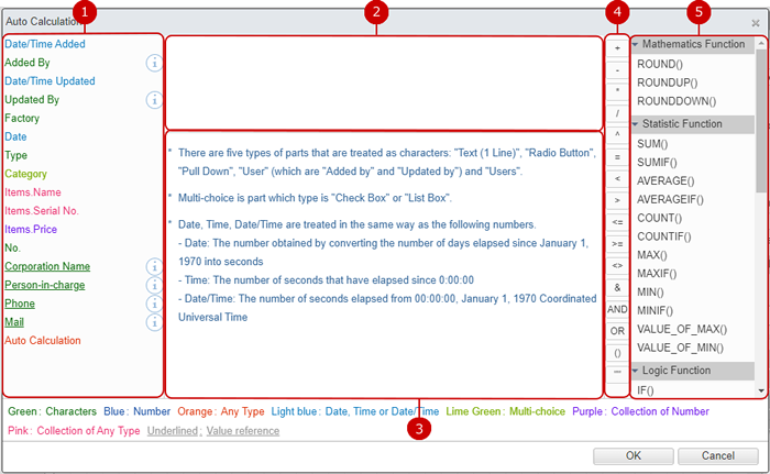
Set calculation formula for auto calculation
Set the calculation formula for auto calculation.
Select the parts to be used in the calculation formula. When you press the part name, the part name is automatically entered in the calculation formula input field.
Enter the calculation formula.
Displays the explanation of operators and functions. It is displayed when the cursor is placed on the operator button or function.
Select the operator to use in the calculation formula. When you press the operator button, the operator is automatically entered in the calculation formula input field.
Select the function to use in the formula. When you press a function, the function is automatically entered in the calculation formula input field.
When the setup is complete, press "OK" button to save the data.
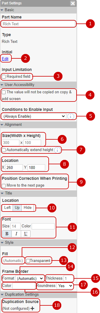
Rich text component settings
You can use the character editing function that allows various decorations such as changing the size and color of characters.
Enter the part name.
Enter a text displayed as the initial text. Pressing the edit link will bring up the rich text editor dialog. (For details, see the description of Rich Text Editor Feature in the User's Manual.)
Check if this field is a mandatory field. If you set it as a required item, * mark will be displayed.
Check it not to duplicated the value of source data initially on the copy & add screen.
Only when the value matches the specified condition, the part can be inputed.
On such state, its value will not be saved when the data have been added/updated.
* You should add condition in [Conditions] before.
* If a changed value have beed disabled, it will not be saved.
* When the data have been added/updated on following, this setting will be ignored.
Import from Excel/CSV File
Auto Action
AppSuite API
Set the width and height of the part.
The height of parts is automatically expanded and contracted. If set, the data will automatically expand and contract so that the data will not be cut off on the reference screen.
Set the coordinates (x axis, y axis) of the part.
If parts are likely to be placed across pages when printing, correct them so that they are placed at the beginning of the next page.
If the paper size is not set on the screen, it will not be corrected.
Select the position to display the part name from "Left" "Up" "Hide".
The character of the part name is decorated. Size: Enter the size of the text.
* You cannot set a value of 7 or less and a value of 73 or more for the character size.
Color: You can select from 60 colors. You can also enter the RGB value in hexadecimal. Style: You can set “bold”, “italic”, and “underline”.
Select the internal color of the part. You can select from 60 colors. You can also enter the RGB value in hexadecimal.
Makes the internal color of the part transparent.
Choose a dash type of the line. Select from Auto, None, Solid line, Dashed line, Dotted line.
Enter the line thickness.
Select a line color. You can select from 60 colors. You can also enter the RGB value in hexadecimal.
Select the rounded corners. Select from No or Yes.
Make settings for copying data from other applications. Select the key part and the copy source part.
* To use this function, it must be linked with another application.
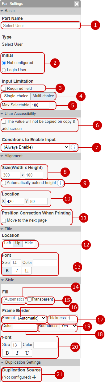
User-selected component settings
Used for items to select users.
Enter the part name.
Select the initial value of user selection. Select from unset and logged-in users.
Check if this field is a mandatory field. If you set it as a required item, * mark will be displayed.
Select the selection method from "Single-choice" or "Multi-choice".
Enter maximum selectable users count when "Multi-choice" is chosen.
Check it not to duplicated the value of source data initially on the copy & add screen.
Only when the value matches the specified condition, the part can be inputed.
On such state, its value will not be saved when the data have been added/updated.
* You should add condition in [Conditions] before.
* If a changed value have beed disabled, it will not be saved.
* When the data have been added/updated on following, this setting will be ignored.
Import from Excel/CSV File
Auto Action
AppSuite API
Set the width and height of the part.
The height of parts is automatically expanded and contracted. If set, the data will automatically expand and contract so that the data will not be cut off on the reference screen.
Set the coordinates (x axis, y axis) of the part.
If parts are likely to be placed across pages when printing, correct them so that they are placed at the beginning of the next page.
If the paper size is not set on the screen, it will not be corrected.
Select the position to display the part name from "Left" "Up" "Hide".
The character of the part name is decorated. Size: Enter the size of the text.
* You cannot set a value of 7 or less and a value of 73 or more for the character size.
Color: You can select from 60 colors. You can also enter the RGB value in hexadecimal. Style: You can set “bold”, “italic”, and “underline”.
Select the internal color of the part. You can select from 60 colors. You can also enter the RGB value in hexadecimal.
Makes the internal color of the part transparent.
Choose a dash type of the line. Select from Auto, None, Solid line, Dashed line, Dotted line.
Enter the line thickness.
Select a line color. You can select from 60 colors. You can also enter the RGB value in hexadecimal.
Select the rounded corners. Select from No or Yes.
The character is decorated. Size: Enter the size of the text.
* You cannot set a value of 7 or less and a value of 73 or more for the character size.
Color: You can select from 60 colors. You can also enter the RGB value in hexadecimal. Style: You can set “bold”, “italic”, and “underline”.
Make settings for copying data from other applications. Select the key part and the copy source part.
* To use this function, it must be linked with another application.
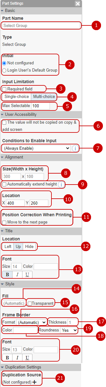
Select group part setting
It is used for items such as selecting an group.
Enter the part name.
Select the default value for group selection. Select from the groups that are not set and represent the login user.
Check if this field is a mandatory field. If you set it as a required item, * mark will be displayed.
Select the selection method from "Single-choice" or "Multi-choice".
Enter maximum selectable groups count when "Multi-choice" is chosen.
Check it not to duplicated the value of source data initially on the copy & add screen.
Only when the value matches the specified condition, the part can be inputed.
On such state, its value will not be saved when the data have been added/updated.
* You should add condition in [Conditions] before.
* If a changed value have beed disabled, it will not be saved.
* When the data have been added/updated on following, this setting will be ignored.
Import from Excel/CSV File
Auto Action
AppSuite API
Set the width and height of the part.
The height of parts is automatically expanded and contracted. If set, the data will automatically expand and contract so that the data will not be cut off on the reference screen.
Set the coordinates (x axis, y axis) of the part.
If parts are likely to be placed across pages when printing, correct them so that they are placed at the beginning of the next page.
If the paper size is not set on the screen, it will not be corrected.
Select the position to display the part name from "Left" "Up" "Hide".
The character of the part name is decorated. Size: Enter the size of the text.
* You cannot set a value of 7 or less and a value of 73 or more for the character size.
Color: You can select from 60 colors. You can also enter the RGB value in hexadecimal. Style: You can set “bold”, “italic”, and “underline”.
Select the internal color of the part. You can select from 60 colors. You can also enter the RGB value in hexadecimal.
Makes the internal color of the part transparent.
Choose a dash type of the line. Select from Auto, None, Solid line, Dashed line, Dotted line.
Enter the line thickness.
Select a line color. You can select from 60 colors. You can also enter the RGB value in hexadecimal.
Select the rounded corners. Select from No or Yes.
The character is decorated. Size: Enter the size of the text.
* You cannot set a value of 7 or less and a value of 73 or more for the character size.
Color: You can select from 60 colors. You can also enter the RGB value in hexadecimal. Style: You can set “bold”, “italic”, and “underline”.
Make settings for copying data from other applications. Select the key part and the copy source part.
* To use this function, it must be linked with another application.
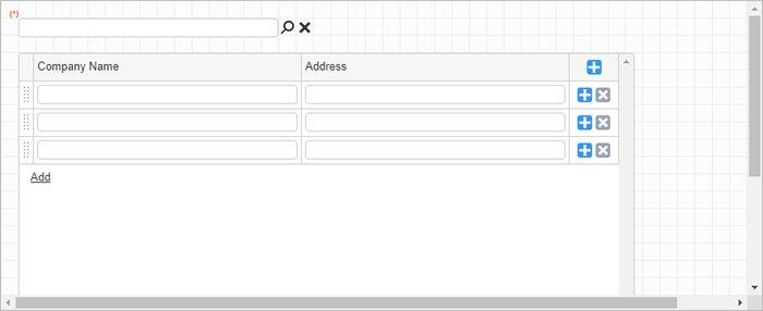
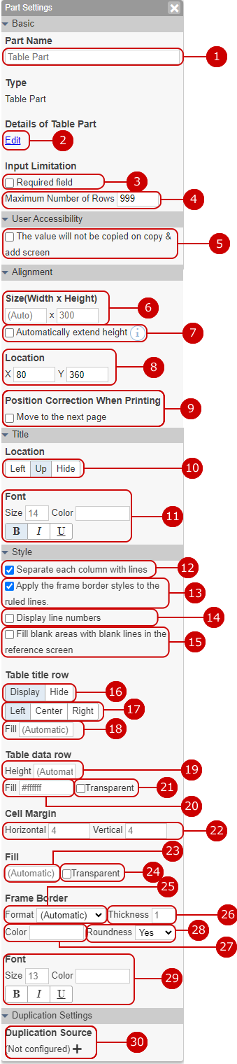
Table part settings
It is used for tabular items in which multiple parts are arranged.
Enter the part name.
Edit the table by arranging multiple parts. When you press the edit link, the table part dialog is displayed.
Check if this field is a mandatory field. If you set it as a required item, * mark will be displayed.
Enter the maximum number of lines.
Check it not to duplicated the value of source data initially on the copy & add screen.
Set the width and height of the part.
The height of parts is automatically expanded and contracted. If set, the data will automatically expand and contract so that the data will not be cut off on the reference screen.
Set the coordinates (x axis, y axis) of the part.
If parts are likely to be placed across pages when printing, correct them so that they are placed at the beginning of the next page.
If the paper size is not set on the screen, it will not be corrected.
Select the position to display the part name from "Left" "Up" "Hide".
The character of the part name is decorated. Size: Enter the size of the text.
* You cannot set a value of 7 or less and a value of 73 or more for the character size.
Color: You can select from 60 colors. You can also enter the RGB value in hexadecimal. Style: You can set “bold”, “italic”, and “underline”.
Draw a separator line on each column.
Format, thickness and color of frame border are applied to ruled lines. If not set, ruled lines will be default format, thickness and color.
The line numbers starting from 1 are displayed at the beginning of each column.
If the number of rows is less than the height of the part, fill in the missing parts with blank lines.
If set to "Not Display", title row of table will not be displayed.
* If title row is not displayed, column width cannot be changed with mouse.
Select the position to display each column of the table title row from "Left Alignment", "Center Alignment" or "Right Alignment".
Select an internal color for the table title row. You can select from 60 colors. You can also enter the RGB value in hexadecimal.
If set, the data rows will be fixed to specified height.
Select an internal color for the table data row. You can select from 60 colors. You can also enter the RGB value in hexadecimal.
Makes the internal color of the table data row transparent. If set, the color of it will be same as the color of the part.
Enter the horizontal and vertical margin of cells.
Select the internal color of the part. You can select from 60 colors. You can also enter the RGB value in hexadecimal.
Makes the internal color of the part transparent.
Choose a dash type of the line. Select from Auto, None, Solid line, Dashed line, Dotted line.
Enter the line thickness.
Select a line color. You can select from 60 colors. You can also enter the RGB value in hexadecimal.
Select the rounded corners. Select from No or Yes.
The character is decorated. Size: Enter the size of the text.
* You cannot set a value of 7 or less and a value of 73 or more for the character size.
Color: You can select from 60 colors. You can also enter the RGB value in hexadecimal. Style: You can set “bold”, “italic”, and “underline”.
Make settings for copying data from other applications. Select the key part and the copy source part.
* To use this function, it must be linked with another application.
* If the application is related to other applications in the table part, you cannot set the copy.
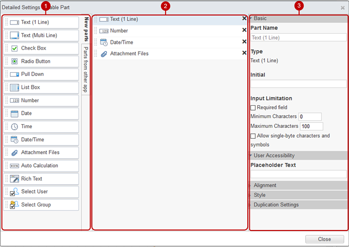
Detailed settings for table part
Create a table by arranging multiple parts. Click the Detail> Edit link of the table part in the Part Settings panel.
* It is not possible to relate to other applications within the table part for which copying is set.
Display the parts in the table. When you select a part, the setting items of the selected part are displayed in the part settings on the right side of the screen. If you press X displayed on the right edge of the part, the part will be deleted.
You can edit the settings of the part. Items that can be set are the same as the parts of the same type in the list format, except for the following points.
There is a setting item "Text Position" in "Alignment", which specifies the position of contents in the cells.
There is a setting item "Do not display when printing" in "Placement". If you apply this setting, the column will not be visible when printed.
Items of fill cannot be set.
"Conditions to Enable Input" cannot be set.
・Place new parts from the parts group
If you hold down the mouse button on the part and move it to the center space, a frame will appear where you can place it. Release the mouse button at that location to place the part.
* If you move from a part group and place it, the settings for that part are displayed in the part setting panel.
・Move parts
You can change the position of the part by holding down the mouse button on the part and moving the mouse up and down and releasing the mouse button at any position.
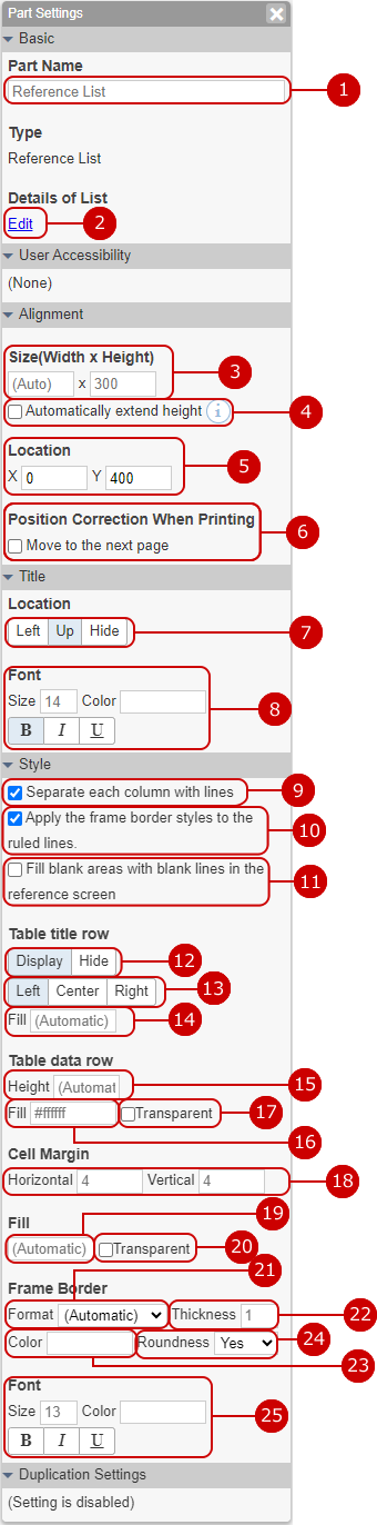
Reference list component settings
The data that matches the value of the specified component of the associated application is displayed in a list.
Enter the part name.
Set the items to be displayed in the list by associating with other applications. When you press the edit link, the reference list dialog is displayed.
Set the width and height of the part.
The height of parts is automatically expanded and contracted. If set, the data will automatically expand and contract so that the data will not be cut off on the reference screen.
Set the coordinates (x axis, y axis) of the part.
If parts are likely to be placed across pages when printing, correct them so that they are placed at the beginning of the next page.
If the paper size is not set on the screen, it will not be corrected.
Select the position to display the part name from "Left" "Up" "Hide".
The character of the part name is decorated. Size: Enter the size of the text.
* You cannot set a value of 7 or less and a value of 73 or more for the character size.
Color: You can select from 60 colors. You can also enter the RGB value in hexadecimal. Style: You can set “bold”, “italic”, and “underline”.
Draw a separator line on each column.
Format, thickness and color of frame border are applied to ruled lines. If not set, ruled lines will be default format, thickness and color.
If the number of rows is less than the height of the part, fill in the missing parts with blank lines.
If it set to "Not Display", title row of table will not be displayed.
* If title row is not displayed, column width cannot be changed with mouse.
Select the position to display each column of the table title row from "Left Alignment", "Center Alignment" or "Right Alignment".
Select an internal color for the table title row. You can select from 60 colors. You can also enter the RGB value in hexadecimal.
If set, the data rows will be fixed to specified height.
Select an internal color for the table data row. You can select from 60 colors. You can also enter the RGB value in hexadecimal.
Makes the internal color of the table data row transparent. If set, the color of it will be same as the color of the part.
Enter the horizontal and vertical margin of cells.
Select the internal color of the part. You can select from 60 colors. You can also enter the RGB value in hexadecimal.
Makes the internal color of the part transparent.
Choose a dash type of the line. Select from Auto, None, Solid line, Dashed line, Dotted line.
Enter the line thickness.
Select a line color. You can select from 60 colors. You can also enter the RGB value in hexadecimal.
Select the rounded corners. Select from No or Yes.
The character is decorated. Size: Enter the size of the text.
* You cannot set a value of 7 or less and a value of 73 or more for the character size.
Color: You can select from 60 colors. You can also enter the RGB value in hexadecimal. Style: You can set “bold”, “italic”, and “underline”.
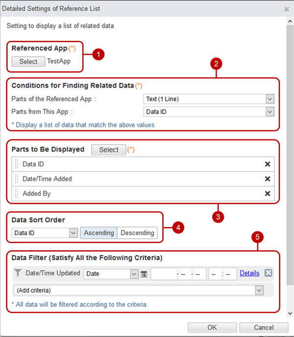
Detailed settings of reference list
The data in which the value of the specified part of the associated application matches will be displayed in the reference list. Click the Details> Edit link in the list on the Part Settings panel.
・Set reference list
Select the referencing application to associate. Click the [Select] button to display the application selection dialog. Select the application to associate.
Select criteria to find relevant data. Select the part of your application and the part of the referenced application.
Select the parts to be displayed in the list. Click the [Select] button to display the component selection dialog. Check the part name displayed in the reference list.
Specify the order of the list. Select the part name and the ascending/descending order that will be the basis of the order.
Specify the conditions to narrow down the data to be displayed. Input method is the same as Filter data
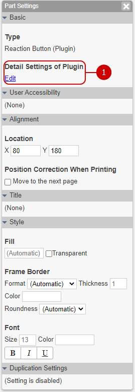
Plugin part settings
The part of installed plugin is displayed.
* Each of plugins has thair own parameters in alignment and style.
Set plugin details. Each of plugins has thair own parameters.
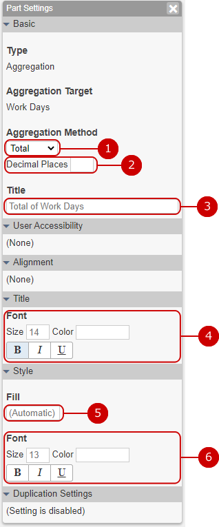
Aggregation part settings
It displays aggregated value.
Choose the aggregation method.
Enter the decimal place of aggregated value.
Enter the title.
The character of the part name is decorated.
Size: Enter the size of the text.
* You cannot set a value of 7 or less and a value of 73 or more for the character size.
Color: You can select from 60 colors. You can also enter the RGB value in hexadecimal.
Style: You can set “bold”, “italic”, and “underline”.
Select the internal color of the part. You can select from 60 colors. You can also enter the RGB value in hexadecimal.
The character is decorated.
Size: Enter the size of the text.
* You cannot set a value of 7 or less and a value of 73 or more for the character size.
Color: You can select from 60 colors. You can also enter the RGB value in hexadecimal.
Style: You can set “bold”, “italic”, and “underline”.
When the setup is complete, press "OK" button to save the data.
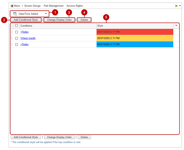
Show a list of conditional styles
If you press "Conditional style" of "Screen" from the header menu, the list screen of conditional styles is displayed.
Select the part for which you want to set the conditional style. Parts with conditional styles are displayed in bold. When you switch, you'll see the conditional style for the selected part.
Display the add screen of the conditional style.
Change the priority of the selected conditional style. Select the screen you want to move from the list and press the [Change Display Order] button to switch to the display order change mode. After entering the display order change mode, select the destination of the selected screen. You can select more than one user.
* You can change the display order by holding down the mouse button on the screen you want to move and moving the mouse and releasing the mouse button at any position.
Deletes the selected conditional style. Click the [Delete] button to display the deletion confirmation dialog.
Display a list of conditional styles. When you click the link of the condition, the change screen of the conditional style is displayed.
* If the data matches the conditions of multiple conditional styles, the style of the top one will be applied.
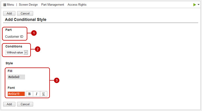
Add conditional styles
Click the [Add Conditional Style] button on the list of conditional styles to display the conditional style addition screen.
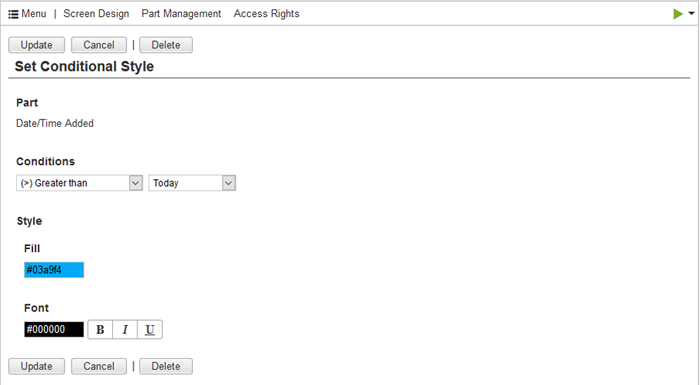
Displays the name of the applicable part.
Set the conditions to apply the style.
Set the style to be applied when the condition is met. The fills and fonts you set are applied instead of those set on the part.
Click "Add" button to save and add the data.
Change conditional style
If you click the link of condition on the list screen of conditional style, the change screen of conditional style is displayed.
Click "Update" button to save the changes.
Remove conditional style
When you click the [Delete] button on the conditional style list screen or change screen, the deletion confirmation dialog is displayed. Click the [Yes] button in the deletion confirmation dialog to delete the corresponding conditional style. The deleted conditional style cannot be restored. Please be careful.
* On the list of conditional styles, you can select multiple conditional styles and delete them all at once.
Display Input Validations
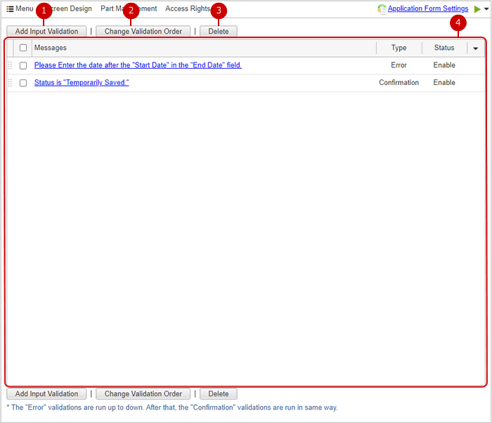
Click "Input Validation" in "Screen" in header menu to display input validation list.
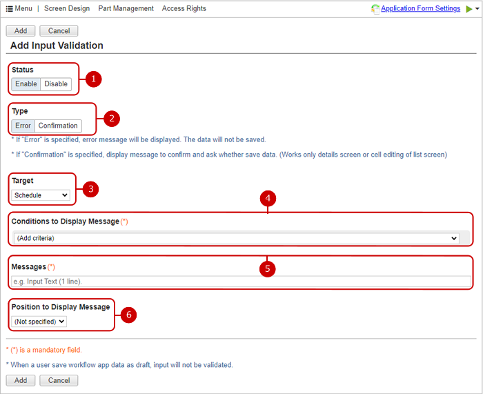
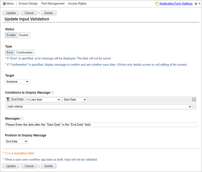
Display the the input validation addition screen.
Change the priority of the selected input validations. Select the screen you want to move from the list and press the [Change Validation Order] button to switch to the validation order change mode. After entering the validation order change mode, select the destination of the selected screen. You can select more than one item.
* You can change the run order by holding down the mouse button on the screen you want to move and moving the mouse and releasing the mouse button at any position.
Deletes the selected input validations. Click the [Delete] button to display the deletion confirmation dialog.
Display a list of input validations. When you click the link of the message, the input validation update screen is displayed.
* Inputed data will be validated with top to bottom "Error" items in the list, then they will be checked with all "Confirmation" items.
Add Input Validation
Click the [Add Input Validation] button on the input validation list screen to display the input validation addition screen.
Set validation enabled or disabled.
Set input validation type.
Choose container of parts which will be specified conditions to display message.
The message will be displayed on a dialog or a balloon when data will match the following conditions to display message.
When data will match the above conditions, the message will be displayed.
Specify the part to display the message. If no part specified, the message will be displayed on dialog.
* This field can be set when the type is "Error".
Click "Add" button to save the data.
Update Input Validation
Click the link of error message on the input validation list screen to display the input validation update screen.
Click "Update" button to save the changes.
Dalete Input Validation
Click the [Delete] button on the input validation list screen or update screen to the deletion confirmation dialog is displayed. Click the [Yes] button in the deletion confirmation dialog to delete the corresponding input validation. The deleted input validation cannot be restored. Please be careful.
* On the input validation list screen, you can select multiple input validations and delete them all at once.
Display Conditions
Click "Conditions" in "Screen" in header menu to display condition list.
Display the the condition addition screen.
Deletes the selected conditions. Click the [Delete] button to display the deletion confirmation dialog.
Display a list of conditions. When you click the link of the name, the conditions update screen of is displayed.
Add Condition
Click the [Add Conditions] button on the condition list screen to display the condition addition screen.
Entry condition name.
Only When the value of the part which specifies the conditions as "Conditions to Enable Input" matches it, the part can input.
Click "Add" button to save the data.
Update Condition
Click the link of error message on the condition list screen to display the condition update screen.
Click "Update" button to save the changes.
Delete Condition
Click the [Delete] button on the condition list screen or update screen to the deletion confirmation dialog is displayed. Click the [Yes] button in the deletion confirmation dialog to delete the corresponding condition. The deleted condition cannot be restored. Please be careful.
* On the condition list screen, you can select multiple conditions and delete them all at once.
Set the order of data
From the header menu, press "Screen" and then "Sort Order Settings" to display the order setting screen.
* You can set the 2nd to 4th sort order of data.
Click the [Update] button to reflect the data order setting.
Select the component for which you want to set the priority from the pull-down.
* Application parts are displayed in the pull-down menu.
Select the ascending or descending order of the parts set in the order.
You can change the priority by dragging and dropping rows.
Part Management
From the header menu, select "Screen" and then "Part management" to display the parts management screen.
Change the display order of the selected parts. Select the part you want to move from the list and click the [Change Display Order] button to switch to the display order change mode. After entering the display order change mode, select the destination of the selected parts. You can also select multiple parts at the same time.
Delete the selected part. Select the part you want to delete from the list and click the [Delete] button to display the deletion confirmation dialog.
* If you delete other parts of the application or parts used or referenced in other applications, please note that the application may not work properly.
Displays the ID of the part.
When you click the link of the part name, the dialog for changing the part name is displayed. You can change the part name from the Change Part Name dialog.
Click on the Confirm Usages link to display the Where Used dialog for this part.
When you click the Confirm application link, a dialog is displayed in which you can check the list of applications that use the relevant component in the relation settings or refer to the relevant component.
Set the other settings
When you press "Others" in "Screen" from the menu, the other settings screen is displayed.
Click the [Update] button to reflect the other settings.
Sets the display method of the screen switching menu of the browse screen.
Pull-down format: Press the screen pull-down to display the menu for selecting the screen.
Top menu format: Menus for selecting screens are displayed side by side at the top of the screen.
Select the display format of date parts and date/time parts for the detail screen.
* The display format for the list screen is applied to the dates in the table part and the dates in the reference list.
* This setting is not reflected on the new data addition screen and change screen.
Select the display format of date parts and date and time parts for the list screen.
* This setting is not reflected on the new data addition screen and change screen.
Set which information of the user is displayed in the select user parts, [Added By], and [Updated By].
* This setting is not reflected on the new data addition screen and change screen.
The label of [Add New], [Copy & Add] and [Add] buttons will be replaced with the values which have been specified here.
Specify the parts of keyword search target.
Set application permissions
When you press "Application" in "Access Rights" from the header menu, the application access right setting screen is displayed.
Click the [Update] button to reflect the access right settings of the application.
Select the users, groups, and roles you want to set for your application. Click the [Select User/Group/Role] button to display the dialog to select users, groups, and roles. (For more details, please refer to Functions common to all screens> Select user/group/role in User's Manual.)
Clears the selected users, groups, or roles.
* At workflow app, "Everyone (All Users)" cannot be cleared.
Set the authority to the application user (user/group/role).
* At workflow app, update right of "Everyone (All Users)" cannot be revoked.
Set data access rights
Press "Data" of "Access Right" from the header menu to display the data access right setting screen.
Click the [Update] button to reflect the data access right setting.
Add data access rights.
Removes the access right for the selected data.
Display a list of data access rights.
* You can change the priority by dragging and dropping the access right.
The conditions of the data to set the access right are displayed. Input method is the same as Filter data
Click the user/group/role link to display the user/group/role selection dialog. Select the user, group, role, or part to be set in the target data. (For more information, please refer to: Set access rights for users, groups, roles, and parts )
Set access rights for parts
When you press [Access]-[Part] from the header menu, the part access right setting screen is displayed.
Click the [Update] button to reflect the access right setting of the component.
Displays a list of access rights for parts. Click the user/group/role link to display the user/group/role selection dialog. Select the user, group, role, or part to be set as the target part. (For more information, please refer to: Set access rights for users, groups, roles, and parts )
* At workflow app, applicant, approvers and workflow administrators can view data regardless this settings.
Set access rights for users, groups, roles, and parts
Set users, groups, roles, and parts that can be referenced/changed/deleted.
Select users, groups, and/or roles that grant access rights. Click the [Select User/Group/Role] button to display the dialog to select users, groups, and roles. (For more details, please refer to Functions common to all screens> Select user/group/role in User's Manual.)
Select the component for which you want to set access rights. Click the [Select Part] button to display the parts selection dialog.
Deselect users, groups, roles, parts.
The users/groups/roles and parts for which access rights are set are displayed in a list. User/group/role (condition), belonging group, and authority are displayed. If the setting target is a user, the belonging group is displayed. If the setting target is an group or an group selection part, the conditions for including or excluding subordinate groups are displayed.
There are three types of permissions: reference, change, and delete.
Part selection dialog Select the component for which you want to set access rights. The parts that can be selected are the system parts "Added By", "Updated By" and group selection parts, and user selection parts.
The system component "Added By", "Updated By", group selection component, and user selection component are displayed in a list. In case of department selection part, condition pull-down to include or exclude subordinate department is displayed in the condition.
When the setup is complete, press "OK" button to save the data.
Display Action List When Data Is Added or Updated
Press "Add/Update Action" of "Auto Action" from the header menu to display adding/updating action list.
Displays the adding/updating action creation screen.
Change run order of the selected actions. Select the screen you want to move from the list and press the [Change Run Order] button to switch to the run order change mode. After entering the run order change mode, select the destination of the selected screen. You can select more than one item.
* You can change the run order by holding down the mouse button on the screen you want to move and moving the mouse and releasing the mouse button at any position.
Delete the selected actions. Press the [Delete] button to display the deletion confirmation dialog.
Display a adding/updating action list. Press the link of the title to display the add/update action update screen. Check icon is displayed at "Add" if the action runs on data adding. Check icon is displayed at "Update" if the action runs on data updating. The status shows whether the action is enabled or disabled.
Create Action When Data Is Added or Updated
Press the [Create] button on the adding/updating action list to display the adding/updating action creation screen.
Select whether the status is enabled or disabled.
Enter a title of action.
Select the processing target.
A data is added: Run when data is added.
A data is updated: Run when data is changed. If you select "One of the selected part is updated", you can specify the parts to be monitored.
If you set a condition, we will run action only if the data meets this condition. Input method is the same as Filter Data
Choose type to run on add/update action. Kind of types are following. Each of type has thair own parameters.
Notification
Select the notification destination.
Set manually: Send a notification to the user selected from the user, group, role, and part. Press the [Select User/Group/Role] button to display the dialog to select users, groups, and roles. Press the [Select Part] button to display the parts selection dialog.
All users that can access to this app: Send a notification to all users who have permission to access the app.
If you check it, the person who added/updated the data will not be notified. If unchecked, the person who added/updated the data will be notified.
Press the [Edit] button to display the notification format dialog. In the Notification Format dialog, enter the notification format.
$$ApplicationName$$: Replaces with the app name.
$$URL_ApplicationTop$$: Replaces with the URL to the TOP (browse screen) of the app.
$$NoticeTitle$$: Replaces with the title.
$$URL_Detail$$: Replaces with the URL of the detail screen.
{{Part name}}: Replaces with the part value.
Choose notification method with "Email", "Whereabouts Message" or "Push Notification to the Mobile App".
* The destination of the notification email will be the address checked in the email address field of the profile change screen for each user.
* A email is sent for every 10 recipient users.
* A whereabouts message is created for every recipient user. It will be counted to be written by the recipient user.
Enter the requester of a message.
This is displayed when "Whereabouts Message" is chosen.
Add data
Select a app to add data.
* You must have manage right of the app to be selected.
Set destination and source part to save. When destination part is radio button or pull down, selection can be set instead of source part.
Click here to display the parts combination to be set in detail.
Creator of saved data is set as chosen user here.
Modify data
Select a app to modify data.
* You must have manage right of the app to be selected.
Specify the conditions to find data to modify. The data which value match with the other will be modified.
Set destination and source part to save. When destination part is radio button or pull down, selection can be set instead of source part.
Click here to display the parts combination to be set in detail.
Choose whether the updater of the destination data is updated with the updater of the source data.
Recalculate the data
Select a app to recalculate.
* You must have manage right of the app to be selected.
Specify the conditions to find data to recalculate. The data which value match with the other will be recalculated.
Add data from tabel part
Select source table part.
Select a app to add data.
* You must have manage right of the app to be selected.
Set destination and source part to save. When destination part is radio button or pull down, selection can be set instead of source part. Parts in the table part can be select as source part.
Click here to display the parts combination to be set in detail.
Creator of saved data is set as chosen user here.
Delete data
Select a app to delete data.
* You must have manage right of the app to be selected.
Specify the conditions to find data to delete. The data which value match with the other will be deleted.
Add event to schedule
Select the parts to specify start and end date/time.
Click the [Edit] button to open the contents form dialog. The event details can be inputed in the dialog.
$$ApplicationName$$: Replaces with the app name.
$$URL_ApplicationTop$$: Replaces with the URL to the TOP (browse screen) of the app.
$$URL_Detail$$: Replaces with the URL of the detail screen.
{{Part name}}: Replaces with the part value.
Choose the optional icons to add to a event.
Choose the part to specify users to add the event.
Choose the recipients.
Choose the user who will add the event.
Choose the color of the event.
Select the icon of the event.
Webhook
Specify the URL to send request.
Specify the access token to send with the request. you can generate a random string.
Choose whether the proxy server will be used on the connection.
Press "Create" button to save and create the data.
Update Action When Data Is Added or Updated
Press the link in the title of add/update action list to display add/update action update screen.
Press "Update" button to save the changes.
Delete Action When Data Is Added or Updated
Press the [Delete] button on the list screen or update screen to display the deletion confirmation dialog. Press the [Yes] button in the deletion confirmation dialog to delete the corresponding action. You cannot recover deleted action. Please be careful.
* On the action list screen, you can select multiple actions and delete them all at once.
Display Action List on Import
Press "Import Action" of "Auto Action" from the header menu to display the import action list.
Display the import action creation screen.
Delete the selected actions. Press the [Delete] button to display the deletion confirmation dialog.
Display a import action list. Press the link of the title to display the import action update screen. The status shows whether the action is enabled or disabled.
Create Action on Import
Press the [Create] button on the import action list screen to display the import action creation screen.
Select whether the status is enabled or disabled.
Enter a title of action.
Select the notification destination.
Specify individually: Send a notification to the user selected from the user, group, and role. Press the [Select User/Group/Role] button to display the dialog to select users, groups, and roles.
All users who can browse the application: Send a notification to all users who have permission to browse the application.
Press the [Edit] button to display the notification format dialog. In the Notification Format dialog, enter the notification format.
$$ApplicationName$$: Replaces with the app name.
$$URL_ApplicationTop$$: Replaces with the URL to the TOP (browse screen) of the app.
$$NoticeTitle$$: Replaces with the title.
$$NumberOfTarget$$: Replaces with the target number of import.
$$NumberOfSuccess$$: Replaces with the number of successful imports.
Choose notification method with "Email", "Whereabouts Message" or "Push Notification to the Mobile App".
* The destination of the notification email will be the address checked in the email address field of the profile change screen for each user.
* A email is sent for every 10 recipient users.
* A whereabouts message is created for every recipient user. It will be counted to be written by the recipient user.
Enter the requester of a message.
This is displayed when "Whereabouts Message" is chosen.
Press "Create" button to save and add the data.
Update Action on Import
Press the link in the title of import action list to display import action update screen.
Press "Update" button to save the changes.
Delete Action on Import
Press the [Delete] button on the list screen or update screen to display the deletion confirmation dialog. Press the [Yes] button in the deletion confirmation dialog to delete the corresponding action. You cannot recover deleted action. Please be careful.
* On the action list screen, you can select multiple actions and delete them all at once.
Display Periodic Action List
Press "Periodic Action" of "Auto Action" from the header menu to display the periodic action list.
* To use "Periodic Action", the desknet's NEO scheduler must be running.
Displays the periodic action creation screen.
Delete the selected actions. Press the [Delete] button to display the deletion confirmation dialog.
Display the periodic action list. Press the title link to display the periodic action update screen. The status shows whether the action is enabled or disabled.
Create Periodic Action
Press the [Create] button on the periodic action list to display the periodic action creation screen.
Select whether the status is enabled or disabled.
Enter a title of action.
Set the action interval. From the pull-down, you can set the action interval by hour, day, week, month.
* The execution time is based on the time zone set in desknet's NEO administrator settings> basic settings> language and time zone settings.
The data that matches the conditions will be processed. Input method is the same as Filter data
Choose type to run on periodic action. Kind of types are following. Each of type has thair own parameters.
Notify Data Count
Select the notification destination.
Set manually: Send a notification to the user selected from the user, group, role, and part. Press the [Select User/Group/Role] button to display the dialog to select users, groups, and roles. Click the [Select Part] button to display the parts selection dialog.
All users that can access to this app: Send a notification to all users who have permission to access the app.
Press the [Edit] button to display the notification format dialog. In the Notification Format dialog, enter the notification format.
$$ApplicationName$$: Replaces with the app name.
$$URL_ApplicationTop$$: Replaces with the URL to the TOP (browse screen) of the app.
$$NoticeTitle$$: Replaces with the title.
$$NumberOfTarget$$: Replaces with the number of targets.
Choose notification method with "Email", "Whereabouts Message" or "Push Notification to the Mobile App".
* The destination of the notification email will be the address checked in the email address field of the profile change screen for each user.
* A email is sent for every 10 recipient users.
* A whereabouts message is created for every recipient user. It will be counted to be written by the recipient user.
Displays the notification source user. Press the [Select] button to display the user selection dialog. (For the user selection dialog, see the description of user/group/role selection in the user's manual.)
* This is displayed when all following are satisfied.
"Email" is chosen.
"Sender Email Address" in [Administrator Settings]-[Mail Server Settings] is set to "Email address of workplace of email sending user".
Enter the requester of a message.
This is displayed when "Whereabouts Message" is chosen.
Notify Content for 1 Data
Select the notification destination.
Set manually: Send a notification to the user selected from the user, group, role, and part. Press the [Select User/Group/Role] button to display the dialog to select users, groups, and roles. Click the [Select Part] button to display the parts selection dialog.
All users that can access to this app: Send a notification to all users who have permission to access the app.
Press the [Edit] button to display the notification format dialog. In the Notification Format dialog, enter the notification format.
$$ApplicationName$$: Replaces with the app name.
$$URL_ApplicationTop$$: Replaces with the URL to the TOP (browse screen) of the app.
$$NoticeTitle$$: Replaces with the title.
$$URL_Detail$$: Replaces with the notified data URL.
{{Part Name}}: Replaces with the part value.
Choose notification method with "Email", "Whereabouts Message" or "Push Notification to the Mobile App".
* The destination of the notification email will be the address checked in the email address field of the profile change screen for each user.
* A email is sent for every 10 recipient users.
* A whereabouts message is created for every recipient user. It will be counted to be written by the recipient user.
Displays the notification source user. Press the [Select] button to display the user selection dialog. (For the user selection dialog, see the description of user/group/role selection in the user's manual.)
* This is displayed when all following are satisfied.
"Email" is chosen.
"Sender Email Address" in [Administrator Settings]-[Mail Server Settings] is set to "Email address of workplace of email sending user".
Enter the requester of a message.
This is displayed when "Whereabouts Message" is chosen.
Recalculate Auto Calculation Parts
* Action with "Recalculate Auto Calculation Parts" can be run once a day for a app. * Recalculation is up to 10000 data.
Delete Data
* Deletable count is up to 10000 data.
Set by time interval
Select how often you want the action to repeat. Select from every 30 minutes, every 1 hour to every 24 hours.
Set the recurrence start date. When you click an entry field, a calendar will be displayed. Click a date on the calendar, and it will be set to the field.
* Enter a date in MM/dd/yyyy format, numeric.
Set the end date of the repetition. When you click an entry field, a calendar will be displayed. Click a date on the calendar, and it will be set to the field.
* Enter a date in MM/dd/yyyy format, numeric.
Set at day intervals
Select how often you want the action to repeat. Select from every 1 day to every 15 days.
Set the recurrence start date. When you click an entry field, a calendar will be displayed. Click a date on the calendar, and it will be set to the field.
* Enter a date in MM/dd/yyyy format, numeric.
Set the end date of the repetition. When you click an entry field, a calendar will be displayed. Click a date on the calendar, and it will be set to the field.
* Enter a date in MM/dd/yyyy format, numeric.
Set the execution time. Click the [Add time] button to add the time input.
Set at weekly intervals
Select how often you want the action to repeat. Select from every 1 week to every 15 weeks.
Select the day of the week for action.
Set the recurrence start date. When you click an entry field, a calendar will be displayed. Click a date on the calendar, and it will be set to the field.
* Enter a date in MM/dd/yyyy format, numeric.
Set the end date of the repetition. When you click an entry field, a calendar will be displayed. Click a date on the calendar, and it will be set to the field.
* Enter a date in MM/dd/yyyy format, numeric.
Set the execution time. Click the [Add time] button to add the time input.
Set at monthly intervals
Select how often you want the action to repeat. Choose any one of Every 1 Month to Every 15 Months.
Choose Repeat Basis. If you select a date, it will be repeated based on the date set as the start date. If you select a day of the week, it will be repeated based on the first to last days of the week.
* If the selected day of the week is before the start date, the repeat will start from the next month.
Set the recurrence start date. When you click an entry field, a calendar will be displayed. Click a date on the calendar, and it will be set to the field.
* Enter a date in MM/dd/yyyy format, numeric.
Set the end date of the repetition. When you click an entry field, a calendar will be displayed. Click a date on the calendar, and it will be set to the field.
* Enter a date in MM/dd/yyyy format, numeric.
Set the execution time. Click the [Add time] button to add the time input.
Press "Create" button to save and add the data.
Update Periodic Action
Press the link in the title of periodic action list to display periodic action update screen.
Click "Update" button to save the changes.
Delete Periodic Action
Press the [Delete] button on the list screen or update screen to display the deletion confirmation dialog. Press the [Yes] button in the deletion confirmation dialog to delete the corresponding action. You cannot recover deleted action. Please be careful.
* On the action list screen, you can select multiple actions and delete them all at once.
Display Mobile App Screen List
If you press "Mobile App Screen Design" of "Mobile App" from the header menu, the screen list screen for the mobile app is displayed. The screens which have been designed on screen design are displayed. Click screen name link to display the screen design screen for mobile app.
* Calendar screens can not be customized for the mobile app, so they are not displayed in the list.
* The next screens are unsupported and not displayed in list: calendar screens and details screen except for default one.
* The screens can not be created or deleted here. They can be created/deleted on the screen design.
(For more information, please refer to: Show screen design)
Update Mobile App Screen Design
Click screen name link in mobile app screen list to display the screen update screen.
Details Format
List Format
The screen name is displayed.
Click to show/hide the part addition panel.
Check to deploy the parts automatically.
This is the part addition panel.
Only the parts which is deployed the screen for browse screen are displayed.
This is the screen design area. The deployed parts are displayed.
To Add Part
Press mouse button on a part in part addition panel and leave it in the screen design area to add the part there.
- Details Format
- List Format
* Parts can be added in the dashed line square which will be displayed during dragging.
* The each areas have maximum deployable parts.
Left top: 1
Right top: 1
Bottom: 2
To Move Part
Press mouse button on a part and leave it to move the part to there.
To Remove Part
Click a part to display the removal button at right top. Click the button to remove the part from the screen.
Click "Update" button to save the changes.
Set other function linkage
If you press "Other Feature Integration" of "Option Feature" from the header menu, the other function linkage setting screen is displayed.
Click the [Update] button to reflect the settings of other functions.
If you enable this feature by checking it, you can create an appointment addition from the data details screen.
Select the initial value of "Date/Time", "Event", "Details", and "Add To" when the screen for adding an appointment is displayed with this function.
If you check this box and enable this function, you can create a workflow application from the data details screen.
Click the [Select] button to open the application form selection window. Select the initial value of the application form when the application creation screen is displayed with this function.
(For more information, please refer to Workflow > Common Function > To Select Application Form in the desknet's NEO User's Manual.)
* The application form is displayed its name and can not be chosen in the workflow app.
Set Identifier for API
From the header menu, press "API settings" in "Option Feature" to display the API settings screen. The identifier is the information to identify the AppSuite app or part. Used by AppSuite command line tool, webhook and AppSuite API, etc.
Click the [Update] button to reflect the identifier for API.
Enter the app identifier.
Check this box and enable part identifier, parts are identified by entered text insted of their name.
Enter the part identifier.
Set Change Log
From the header menu, press "Change Log Setting" in "Option Feature" to display the change log setting screen. Set to save change log to record changed values and changer when data is added or updated.
Click the [Update] button to reflect the change log setting.
Choose whether change log is saved or not.
Recalculate auto calculation parts
Press "Recalculate" from "Operational Management" from the header menu to display the recalculation screen. This is a function that allows you to recalculate all auto calculation parts. Recalculate auto calculation parts. The auto calculation parts of the registered data are not recalculated just by changing the calculation formula of the auto calculation parts, so recalculate using this function.
If you check "Recalculate all data" and click the [Recalculate] button, all data will be recalculated.
The recalculation result and the processing date are displayed.
Set management notes
From the header menu, press "Notes" under "Operational Management" to display the administration memo setting screen.
Click the [Update] button to reflect the entered management memo contents.
Enter notes.
Check the error log
When you press "Error Log" in "Operational Management" from the header menu, the error log confirmation screen is displayed. An error log is displayed when notification (email sending) fails or periodic aggregation fails.
Example when error log is saved
When notification (email transmission) fails due to reasons such as being unable to connect to the outgoing mail server
When notification (Webhook) fails due to reasons such as being unable to connect to the destination
If the scheduled aggregation fails because the parts used in the summary items have been deleted
Click the [Delete All] button to display the deletion confirmation dialog. Click the [Yes] button in the deletion confirmation dialog to delete all error logs. The deleted error log cannot be restored. Please be careful.
Click the [Detail Download] button to start downloading the error log.
The error log list is displayed. Click the date/time occurrence to display the error details dialog.

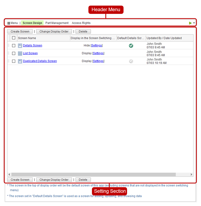
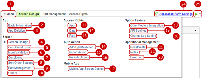
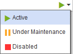
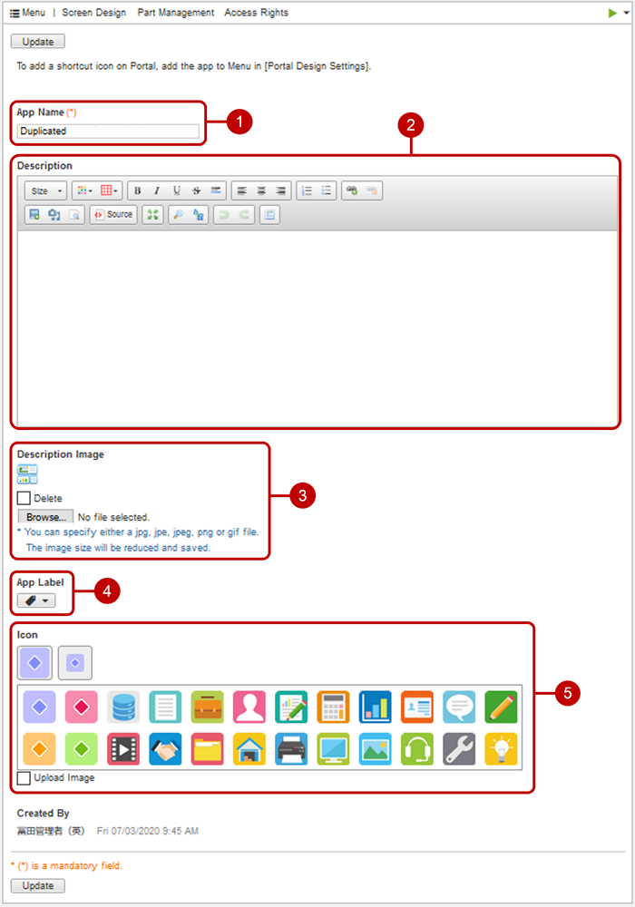
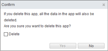
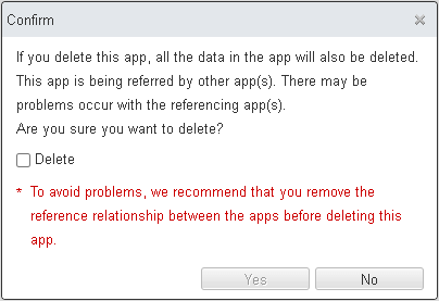
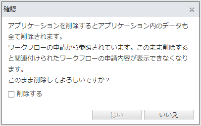
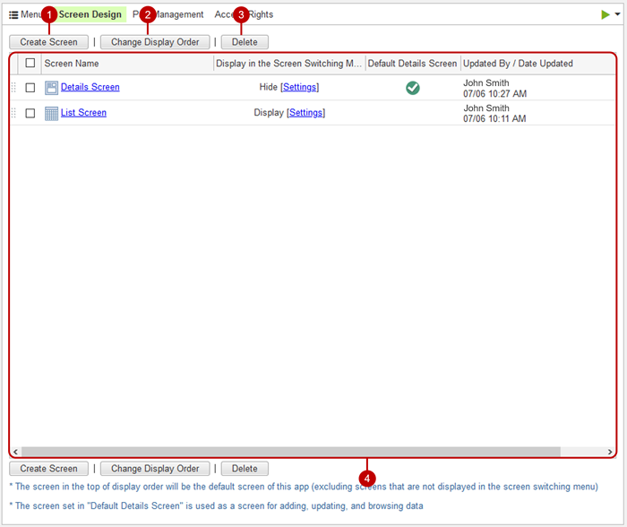
 here.
here.