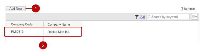
Display App List
A list of apps that you can use is displayed.
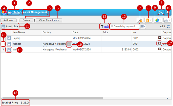
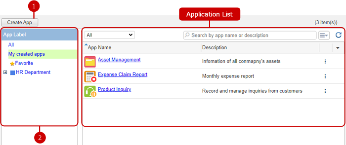 App List
 A list of apps. (Details below)
Display Data List
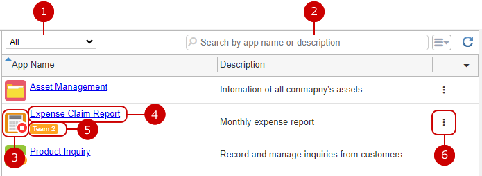
Press the app name link on the app list screen to move to the browse screen.
-
Press the AppSuite link to return to the app list screen.
-
The app name is displayed.
-
Switch AppSuite to full screen view.
-
Add new data.
* Access rights are required for this operation. App administrators can grant permissions.
-
Delete the data.
Select the one you want to delete from the list and click this button to delete it. You can also select multiple data at the same time.
* Access rights are required for this operation. App administrators can grant permissions.
-
The following functions are available.
-
Replace Value
* Access rights are required for this operation. App administrators can grant permissions.
(For more information, please refer to Edit Data of Replace Multiple Data at Once.)
-
Recalculation
* Access rights are required for this operation. App administrators can grant permissions.
(For more information, please refer to Edit Data of Recalculate.)
-
Batch Editing
* Access rights are required for this operation. App administrators can grant permissions.
(For more information, please refer to Edit Data of Edit Multiple Data at Once.)
-
Freeze Column
(For more information, please refer to Freeze Column.)
-
Export to CSV File
* Access rights are required for this operation. App administrators can grant permissions.
(For more information, please refer to Save (Export) Data to a File.)
-
Import from Excel/CSV File
* Access rights are required for this operation. App administrators can grant permissions.
(For more information, please refer to Batch Register (Import) Data from File.)
-
Delete All Data
* Access rights are required for this operation. App administrators can grant permissions.
(For more information, please refer to Delete Data.)
-
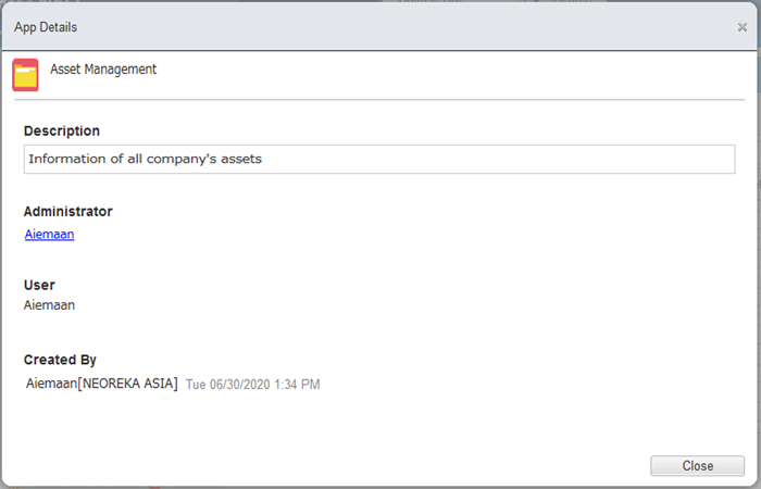
About This App
Displays detailed app information in a dialog.
-
Display the app setting screen.
* Not displayed for users who do not have permission to manage apps.
-
Manage and use your favorite search conditions.
(For more information, please refer to Manage Your Favorite Search Criteria.)
-
Display the data aggregation screen.
(For more information, please refer to Display the Aggregation Result.)
-
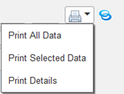
Print the list of data.
-
Print All Data: Print all data in a list in list format.
-
Print Selected Data: Prints the data selected in the check box in list format.
-
Print Details: Prints in detailed format.
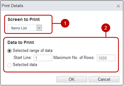
- Select the detail screen to use for printing.
- Select data to print.
- Selected range of data: Prints the data in the specified range in the list.
- Selected data: Prints the data selected in the check box.
-
Switch screens.
 List format screen
 Detailed format screen
 Calendar format screen
-
Narrow down the data to be displayed. (For more information, please refer to Filter Data.)
-
Perform a keyword search.
* If you want to specify more than one keyword, use space to separate keywords.
* Specifying multiple keywords will perform "AND" search. This means the search results contain all the keywords that you specified.
-
Select the data in the check box.
A check box will appear when you hover the mouse cursor over a row of data.
-
Display the details of the data.
* If the detailed format screen is not set, this icon is not displayed.
(For more information, please refer to Display Data Details.)
-
Displayed when the mouse cursor is placed on a cell whose value is omitted.
When pressed, the full value is displayed in a speech bubble.
* This button is displayed when there are values for text (multiple lines), attachment files in list display, and rich text.
-
Display the detail screen of the referenced data.
* Displayed only when the duplicated values of the referenced key components are prohibited.
-
Display aggregated values.
* Displayed only when aggregation parts have been set with screen design.
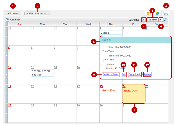
Display Data Calendar
Select the calendar format screen from the screen switching menu.
-
Add new data.
* Access rights are required for this operation. App administrators can grant permissions.
-
"Export to CSV File", "Import from Excel/CSV File", "About This App" are available.
The action is the same as "Other Functions" of Display Data List.
- Print the displayed calendar.
- Display the calendar for the previous month.
- Display this month's calendar.
- Display the calendar for the next month.
-
Double-click to display the new addition screen with the date as the initial value.
* Access rights are required for this operation. App administrators can grant permissions.
-
Shows the speech bubble.
* If the speech bubble part is not set, the detailed data screen is displayed.
- Display the data detail screen.
-
Display the data edit screen.
* Access rights are required for this operation. App administrators can grant permissions.
-
Displays the new addition screen in which the data contents are copied.
* Access rights are required for this operation. App administrators can grant permissions.
-
Delete the data.
* Access rights are required for this operation. App administrators can grant permissions.
Display Data Details
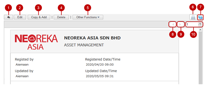
Click the detail icon on the browse screen (list display) to display the detail screen of the corresponding data.
-
Return to the list display.
-
Display the screen for editing the data you are displaying.
* Access rights are required for this operation. App administrators can grant permissions.
-
Displays a new addition screen that duplicates the contents of the data you are displaying.
* Access rights are required for this operation. App administrators can grant permissions.
-
Delete the data you are displaying.
* Access rights are required for this operation. App administrators can grant permissions.
-
The following functions are available.
-
Export to HTML File
You can save the data you are browsing to a file.
-
Schedule
* Displayed only when the app administrator has enabled this function.
Display the screen for adding a schedule with the data value as the initial value.
The URL of the data details screen is set as the initial value in "Contents".
-
Workflow
* Displayed only when the app administrator has enabled this function.
Display the creation screen of the workflow application to which the data you are browsing is attached.
-
Show Data Change Log
* Displayed only when the app administrator has enabled this function.
(For more information, please refer to: Show Data Change Log )
-
About This App
Displays detailed app information in a dialog.
-
The print display screen of the data you are viewing and the print dialog are displayed.
If the [▼] icon is displayed, you can select another screen.
-
You can issue a shortened URL by pressing the share icon.
(For more information, please refer to Use Shortened URL.)
- The data before the displayed data is displayed.
- The data after the displayed data is displayed.
-
Moves to the specified data.
Specify the number of data to display from the top in the input field.
The number on the right is the total amount of data that matches the current search criteria.
Use Shortened URL
You can use the shortened URL by pressing the share icon.
The shortened URL can be used for posts with a limited number of characters, such as tweets on Neotwi, by shortening the URL of the screen you are referring to.
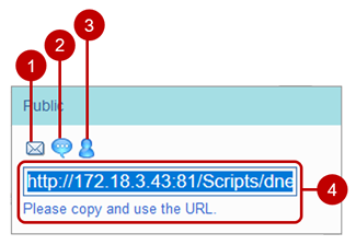
You can also check the issued shortened URL from the list of shortened URLs on Neotwi.
(For more information, please refer to
Neotwi in desknet's NEO User's Manual.)
Freeze Column
You can pin the left column so that it doesn't move when you scroll horizontally.
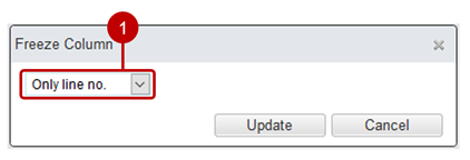
- Select up to which column to fix.
After completing the settings, click the [Update] button to save the settings.
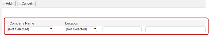
Add Data
Click the [Add New] button to display the screen for adding new data.
* Access rights are required for this operation. App administrators can grant permissions.
-
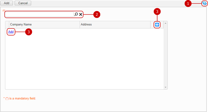
You can issue a shortened URL by pressing the share icon.
(For more information, please refer to Use Shortened URL.)
-
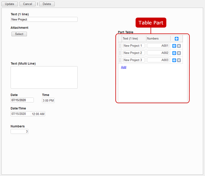
You can automatically enter the data of other applications selected in the data selection dialog.
Press the magnifying glass icon to display the data selection dialog.
Pressing the × icon erases all data retrieved from the associated application.
-
Add a row to the table.
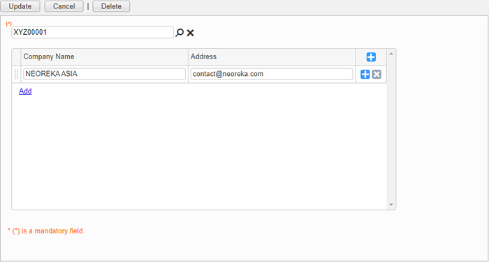
Enter Data from Other Apps
Display the data selection dialog from the magnifying glass icon of the key part and input data to the copy part and reference part of another app.
The selected data will be input to the related key parts, copy parts, and reference parts.
When you have completed all the entries, press the [Add] button to save the data.
Edit Data
You can change the registered data by one of the following methods.
- Edit one by one
- Edit Multiple Data at Once
- Edit Only the Data in the Double-clicked Cell
- Replace Multiple Data at Once
- Recalculate
■ Edit one by one Click the [Edit] button on the screen displaying the data details to display the data edit screen.
* Access rights are required for this operation. App administrators can grant permissions.
Click "Update" button to save the changes.
■ Edit Multiple Data at Once
You can change the data in a batch by clicking "Batch Editing" in the [Other Functions] menu on the list screen.
* Access rights are required for this operation. App administrators can grant permissions.
Click the [Other Functions] button and select the "Batch Editing" menu. 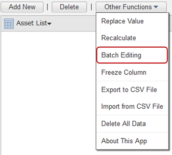 Batch change screen
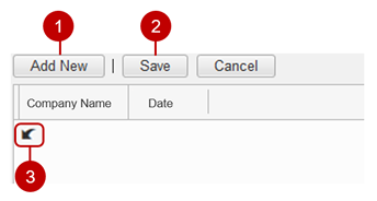
- Add new data.
- Save the modified data.
- Restores the contents of the data.
■ Edit Only the Data in the Double-clicked Cell You can change the data by double-clicking on the cell where the data on the list screen is displayed.
* Access rights are required for this operation. Application administrators can grant permissions.
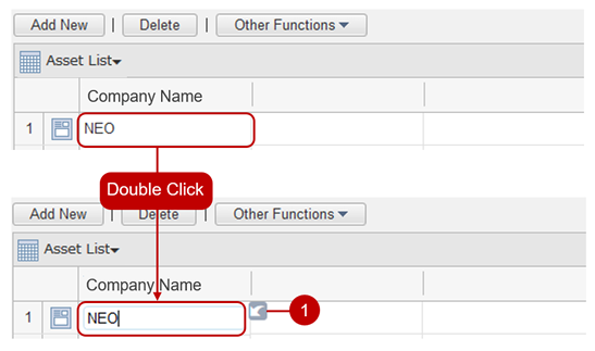
- Restores the contents of the data.
When the focus is removed from the input field, the data will be saved.
■ Replace Multiple Data at Once
On the list screen, click [Replace value] in the [Other functions] menu to display the replace value dialog.
Data can be replaced in a batch for each part.
* Access rights are required for this operation. Application administrators can grant permissions.
Select the "Replace Value" menu from the "Other functions" button 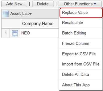 replace value dialog (1/2)
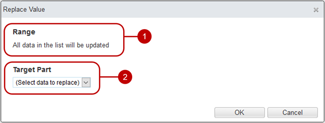
-
The range to replace.
If you open the Replace Value dialog box with data selected on the list screen, the selected data will be the range to be replaced.
-
Select the part to replace.
When you select the target part, the input field for the replacement contents is displayed.
Replace value dialog (2/2) 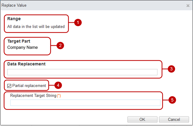
Click the [OK] button to display the confirmation dialog.
Select "Replace" in the confirmation dialog and click the [Yes] button to start replacement.
When the replacement is complete, the Value Replacement Complete dialog is displayed.
* If there is data that could not be replaced, a link to download the log file will be displayed in the dialog box for replacing values.
■ Recalculate
When you press [Recalculate] in the menu that appears when you press the [Other Functions] button on the list screen or detail screen, the recalculation confirmation dialog is displayed.
再計算 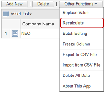
When the recalculation confirmation dialog is opened from the list screen, check "Recalculate" and click the [Yes] button to recalculate the values of the auto calculation parts for all data in the list.
If you open the recalculation confirmation dialog from the detail screen, click the [Yes] button to recalculate the value of the auto calculation part of the corresponding data.
* Access rights are required for this operation. App administrators can grant permissions.
Delete Data
Click the [Delete] button on the list screen, detail screen, and change screen to display the deletion confirmation dialog.
Click the [Yes] button in the deletion confirmation dialog to delete the corresponding data. The deleted data cannot be restored. Please take note.
Delete all data in the list 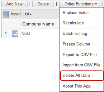
Click the [Other functions] button and then click "Delete all data in list" in the menu that appears to display the deletion confirmation dialog.
Select "Delete" in the deletion confirmation dialog and click the [Yes] button to delete all the data in the list. The deleted data cannot be recovered. Please take note.
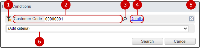
Filter Data
This is a function to narrow down the data to be displayed.
Click the link to display the narrowing condition dialog.
-
When pressed when the value of the condition term is set, the value of the condition term becomes empty.
When the value of the condition item is not set, it is displayed in gray.
- The target part, operator, and value of the condition item are displayed.
- (Key part only) Select the data of destination app from dialog to fill the value.
- Switches the condition term to advanced search.
- Delete the conditional term.
- Add a condition term for the selected part.
Click the [Search] button to display the data corresponding to the entered search conditions in a list.
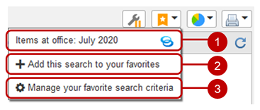
Manage Your Favorite Search Criteria
This is a convenient function that allows you to register the status of the displayed screen as a favorite search condition and display it again later.
The four states of screen, refinement, keyword search, and order are saved.
-
This is a list of favorite search conditions.
Press the favorite search condition name to display the saved favorite search condition screen.
You can issue a shortened URL by pressing the share icon.
(For more information, please refer to: Use shortened URL )
-
Add your favorite search criteria.
When selected, a dialog box for entering the favorite search condition name is displayed. Enter the favorite search condition name and save.
-
Displays the management dialog of favorite search conditions.
Manage favorite search conditions dialog 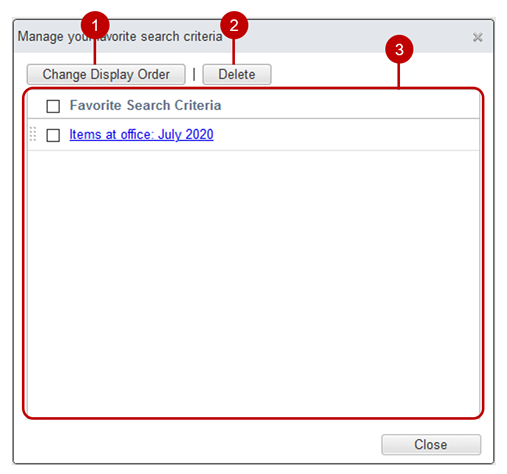
-
Change the display order of the selected favorite search conditions.
Select the favorite search condition you want to move from the list and press the [Change display order] button to switch to the display order change mode.
After entering the display order change mode, select the destination of the selected favorite search conditions. You can also select multiple favorite search conditions at the same time.
-
Deletes the favorite search condition selected in the check box.
-
When you click the link for the favorite search condition name, the dialog box for changing the favorite search condition name is displayed.
You can change the favorite search condition name from the Change Favorite Search Condition Name dialog.
Save (Export) Data to a File
Click the [Other Functions] button and click "Export to CSV file" in the displayed menu to display the CSV file export dialog box.
You can save the registered data to a file.
Export to CSV file (1/2) 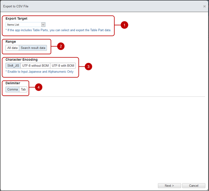
-
Save the selected target data.
If your application uses table part, table part are also displayed as options.
Table part used in the application (example)
-
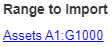
Specify the range of data to export.
-
Select character code.
-
Choose a delimiter.
Click the [Next>] button to display the setting screen for the output parts.
Export to CSV file (2/2) 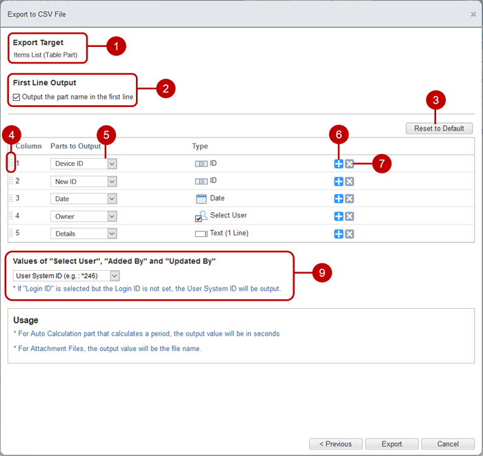
-
The application name or table part name selected in the previous setting is displayed.
-
Specify whether to output the component name in the first line.
-
Returns the list status to the default value.
* You can restore the export information saved when the previous CSV file was exported to the default value.
-
Change the order of parts.
* You can change the order by holding down the mouse button on the handle icon of the part you want to move, move the mouse, and release the mouse button at any position.
-
Select the parts to output.
-
Press the button to add a line below.
-
Delete the line.
-
Select the value of "Select Group" part.
* Displayed only when there is an select group part.
-
Select the values for the "Select User", "Added By", and "Updated By" parts.
After all the input is completed, click the [Export] button to display the CSV export completion dialog.
You can save the CSV file by clicking the download link in the CSV export complete dialog.
Batch Register (Import) Data from File
Click the [Other Functions] button and click "Import from Excel/CSV file" in the menu that appears to display the Import from Excel/CSV file dialog box.
Data can be registered collectively from a file.
Import from Excel/CSV file (1/2) 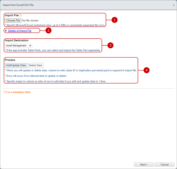
- Choose a file to import.
- Click it to display specification of the file to import.
-
Save the selected target data.
If your application uses table part, table part are also displayed as options.
-
Select the process to execute.
Click the [Next>] button to display the setting screen for the parts to be registered all at once.
Import from Excel/CSV file (2/2) 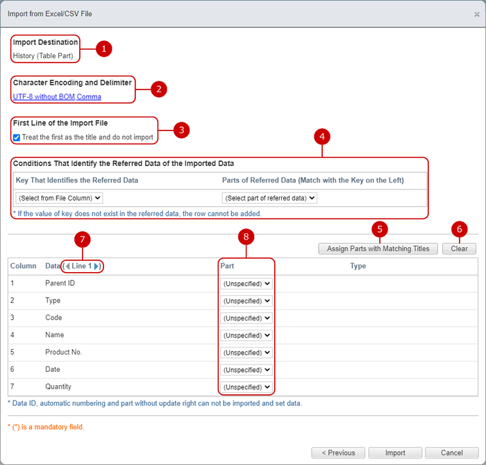
After inputting all the items, click the [Import] button to display the confirmation dialog.
Click the [Yes] button in the confirmation dialog to start the import.
When the import is completed, the import complete dialog is displayed.
* If the import fails, the import will be interrupted at that point. Delete the line before the error occurred from the file and try importing again.
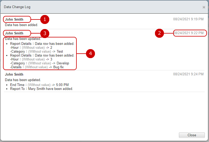
Show Data Change Log
Click the [Other Functions] button and click "Show Data Change Log" in the menu that appears to display the data change log dialog box.
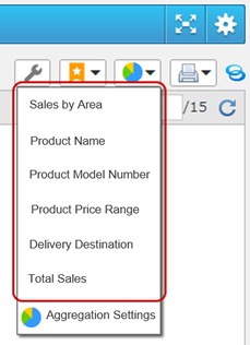
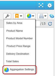
Display the Aggregation Result
Select the aggregation you want to view from the aggregation menu and display the aggregation result screen.
* If no aggregation has been created, only "Aggregation settings" will be displayed in the menu.
 Aggregation result screen
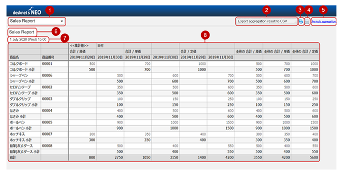
-
The aggregates that can be viewed are displayed.
Select the aggregation from the pull-down to switch the display to the target aggregation.
-
The dialog to save the aggregation result in a CSV file and export it will be displayed.
You can use the exported CSV file data to create Excel pivot tables and graphs.
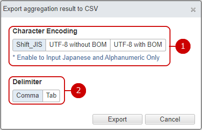
- Select the character code.
- Choose a delimiter.
* When the auto calculation component whose calculation result display format is "Period" is set for the aggregated value, the value of the export result of the aggregated result is output in "seconds".
-
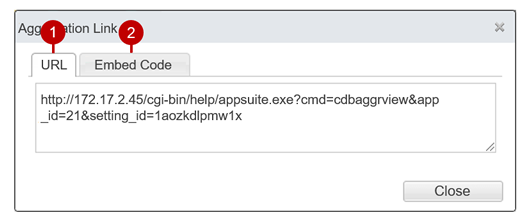
Click the share icon to display the aggregation result link dialog.
- If you press the link for selecting periodical aggregation results, the periodical aggregation result log dialog will be displayed.
- If you press the link for selecting periodical aggregation results, the periodical aggregation result log dialog will be displayed.
- The aggregate name is displayed.
- Displays the date and time when the periodic aggregation is executed.
* It is not displayed in the summary that does not perform the periodic aggregation.
* Displayed in the time zone of the user who is browsing.
-
The graph is displayed.
The aggregation set to "Perform" for periodic aggregation displays the aggregation result created by the periodic aggregation process.
Aggregation for which the periodic aggregation is set to "No" will display the real-time aggregation results.
The aggregation is executed on access rights and time zone of the aggregator at [Aggregation Management > Aggregation Options > Aggregator]. So data which can not be displayed by a browsed user may be aggregated in it.
Screen configuration and basic operation
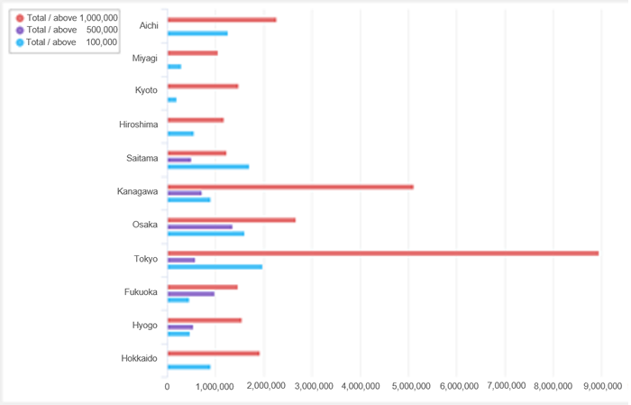
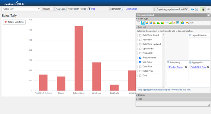
The application data can be aggregated and displayed as a graph.
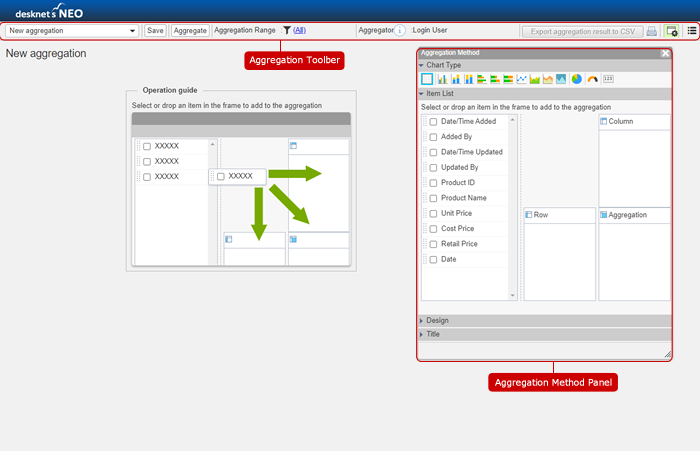 Aggregation Toolbar (New)
  Aggregation toolbar (change)
  Aggregation method panel
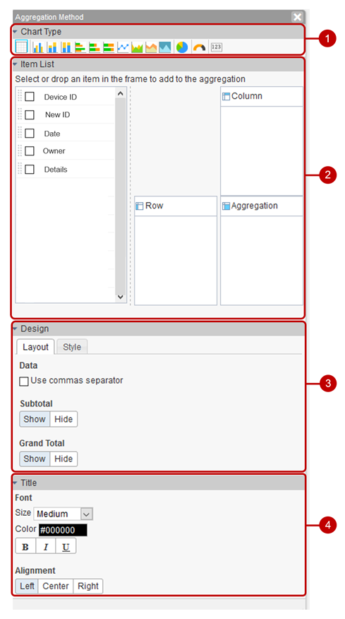
This panel allows you to edit the aggregation method.
The items to be set, such as the item list and design, will change depending on the type of graph.
-
The type of graph is displayed.
-
A list of items required for each type of graph is displayed.
-
The settings related to the graph design are displayed.
-
The settings of the graph title (total name) are displayed.
Add aggregation settings
When you press "Total setting" in the total menu, a new total setting screen will be displayed.
 Aggregation setting screen
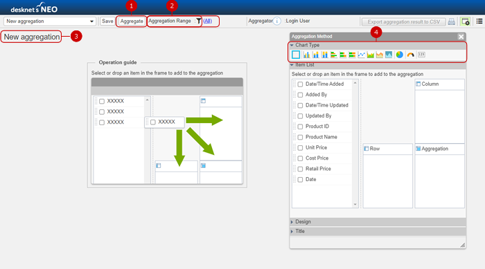
-
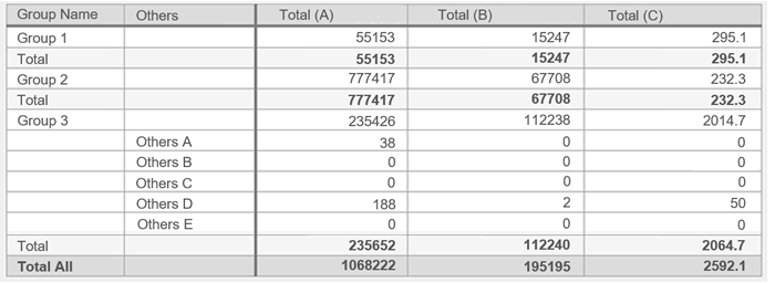
Aggregation is executed based on the set row/column/aggregate value.
-
Narrow the range of data to be aggregated.
-
The new summary name is displayed.
You can change the summary name by pressing the summary name.
-
Select the graph type and set the aggregation method.
See the following explanation for the setting method for each graph.
- Create a crosstab
- Create bar charts, line charts, and area charts
- Create a pie chart
- Create a gauge chart
- Create a card
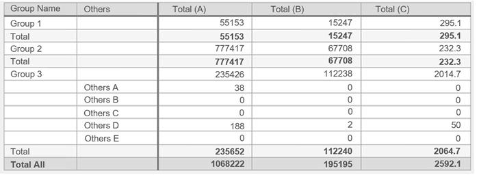
| Graph name |
Example of aggregation |
Feature |
| Cross tabulation |
|
This is a method for extracting and analyzing data from two or more items.
|
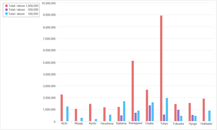
| Column chart |
|
The size of the aggregate value of each item is compared.
It can also represent changes over time.
|
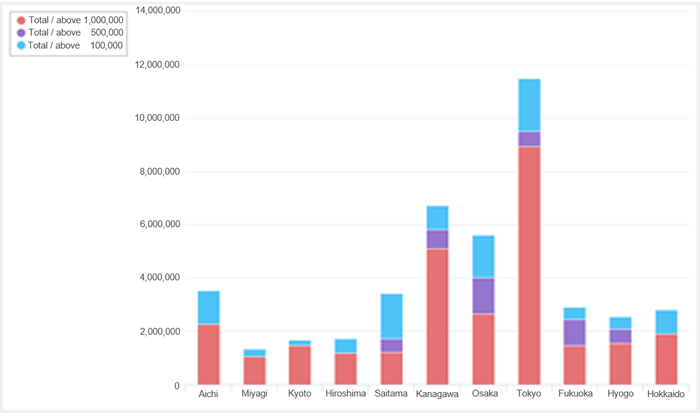
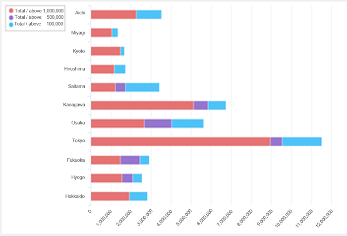
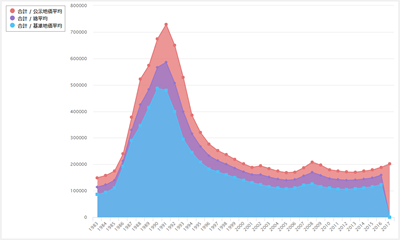
| Stacked column chart |
|
Compare the sum of the aggregated values of each item..
It can also represent changes over time.
|
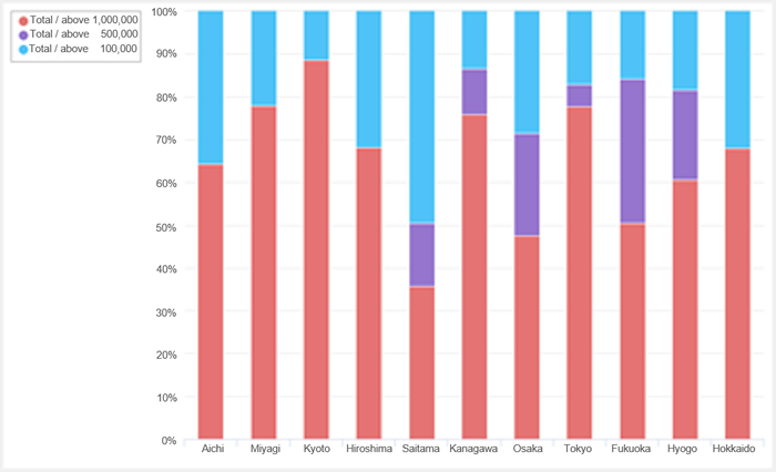
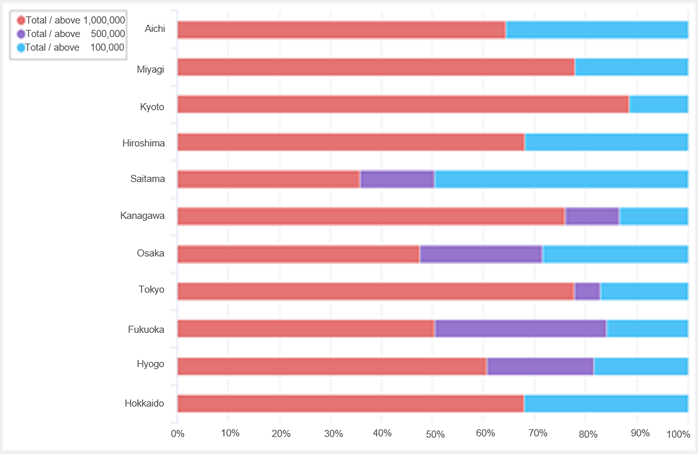
| 100% stacked column chart |
|
Compare the ratio of the aggregate value of each item.
It can also represent changes over time.
|
| Bar chart |
|
The size of the aggregate value of each item is compared.
It can also represent changes over time.
|
| Stacked bar chart |
|
Compare the sum of the aggregated values of each item..
It can also represent changes over time.
|
| 100% stacked bar chart |
|
Compare the ratio of the aggregate value of each item.
It can also represent changes over time.
|
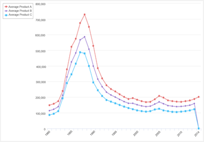
| Line graph |
|
It is suitable for expressing changes in aggregated values over time.
|
| Area chart |
|
It is a line graph that is colored.
|
| Stacked area chart |
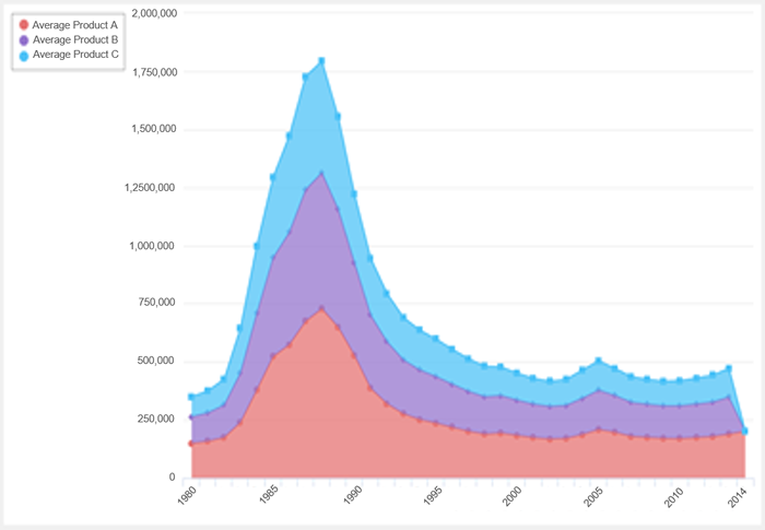
|
This is a graph showing the total of each aggregated value of the area graph.
|
| 100% stacked area chart |
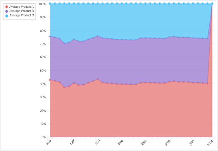
|
This is a graph showing the ratio of each aggregated value in the area graph.
|
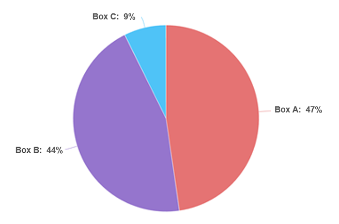
| Pie Chart |
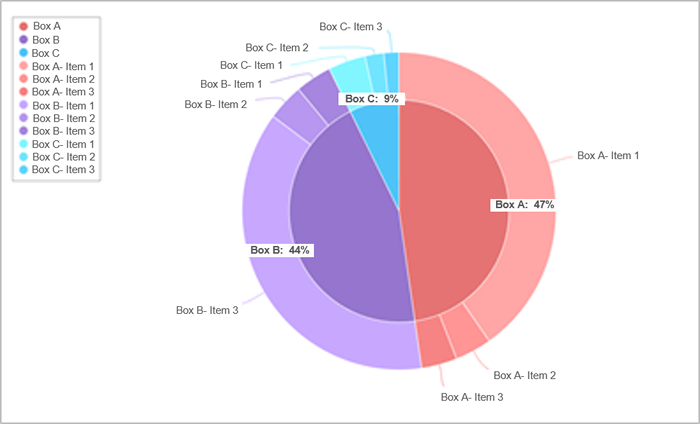
|
It is a graph showing the ratio of each item to the whole.
|
| gauge |

|
It is a graph showing the achievement rate of aggregated values.
|
| card |
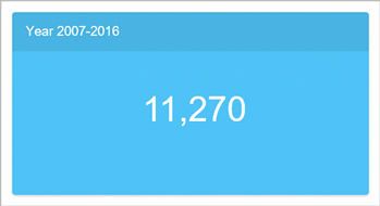
|
Highlight only the aggregation result.
|
After entering the information, click the [Save] button to display the publishing settings dialog.
Public settings dialog 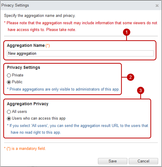
-
Enter the aggregation name.
-
Choose whether to publish or hide the aggregation.
-
Display the disclosure range of the aggregation result.
The aggregation setting will be added with "All users that can access to this app".
You can change this to "Set manually" or "All users" after the aggregation setting have been saved and "Aggregator" of [Aggregation Options] have been set "Set manually".
After completing all the entries, click the [Save] button to save the data.
Create a crosstab
Cross tabulation is a method of extracting and analyzing two or more items for data analysis and tabulation.
 Aggregation method: Item list
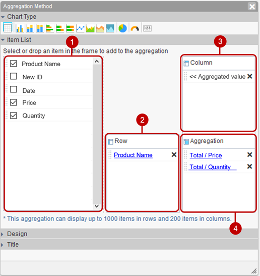
-
Select the parts to be used in the aggregation from the list.
* Text (multi line), table part, and parts in the reference list cannot be used for aggregation.
* select user parts are used for the first user, and select group parts are used for the first group.
* You can place a component by holding down the mouse button on the component and then releasing the mouse button on the "Row", "Column", and "Aggregation".
-
The parts set in the row are displayed in a list.
If you set up multiple parts, you will be able to insert subtotal rows in the summary.
-
The parts set in the column are displayed in a list.
-
Displays the parts that are set to the aggregated value in a list.
Row and column parts settings You can make settings for parts in rows and columns.
Click the link of the part name to display the setting dialog.
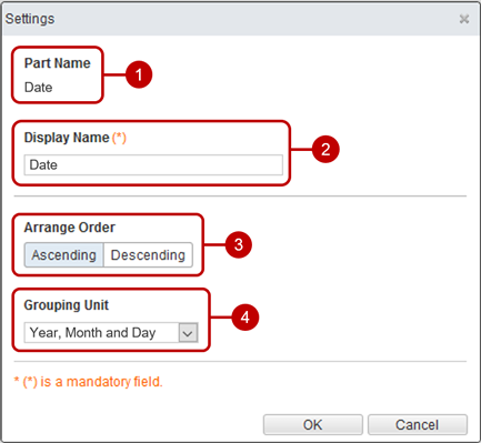
- The name of the target part.
- Enter the display name.
- Select the order of data from ascending/descending order.
-
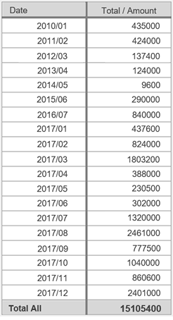
Select the unit of grouping when the part type is Date or Date/Time.
(Example) Grouping by "year/month"
|
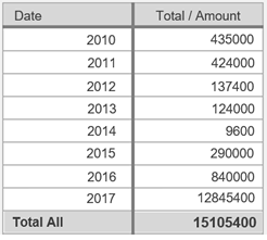
(Example) Grouping by "year"
|
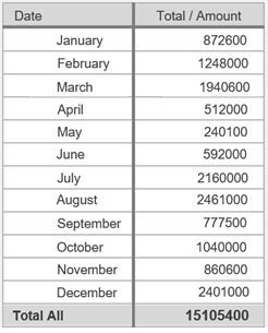
(Example) Grouping by "month"
|
When the entry is complete, press "OK" button to save the data.
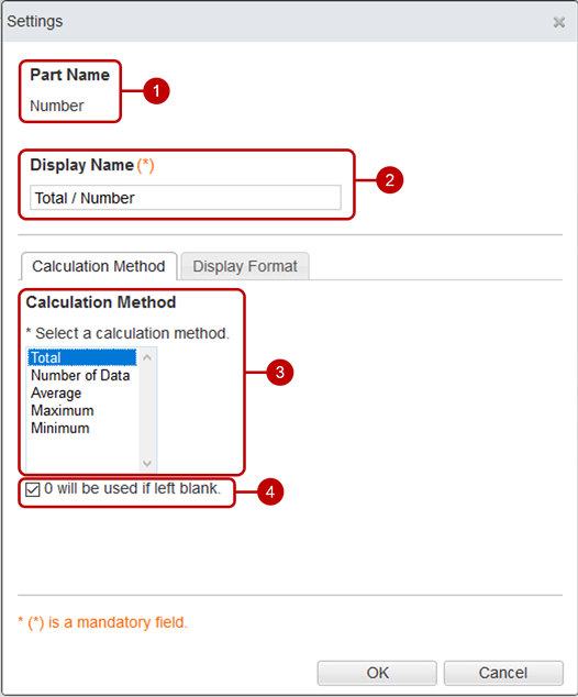
Setting aggregated values (calculation method) Settings can be made for the aggregated value parts.
Click the link of the part name to display the setting dialog.
 Set aggregated value (display format)
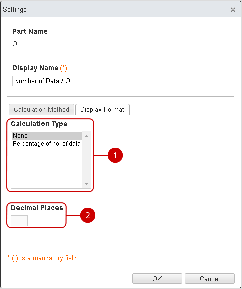
When the entry is complete, press "OK" button to save the data.
Aggregation method: Design (layout)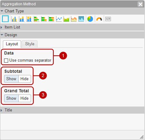
- Sets the digit grouping (,) display.
-
Select whether to display subtotal rows.
Subtotal is displayed when multiple line items are selected.
- Select whether to display the grand total row.
Aggregation method: Design (style) 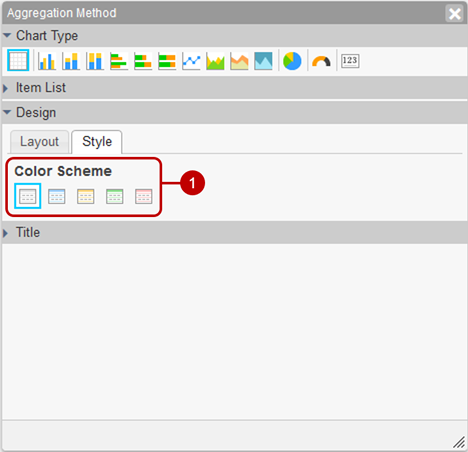
- Select the table color scheme.
Aggregation method: Title 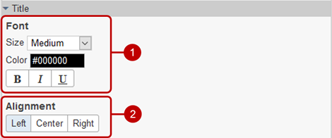
-
The character is decorated.
Size: Select the size of the text.
Color: You can select from 60 colors. You can also enter the RGB value in hexadecimal.
Style: You can set “bold”, “italic”, and “underline”.
-
Position to display title Select from "Left alignment", "Center alignment" or "Right alignment".
Create bar charts, line charts, and area charts
Visualize data visually from legends, axes, and aggregated values.
 Aggregation method: Item list
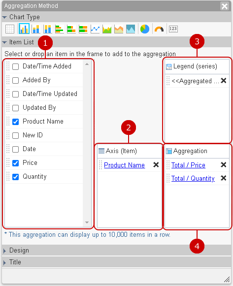
-
Select the parts to be used in the aggregation from the list.
* Text (multi line), table part, and parts in the reference list cannot be used for aggregation.
* Check box and list box parts cannot be used for 100% stacked vertical bar graph, 100% stacked horizontal bar graph, 100% stacked area graph.
* select user parts are used for the first user, and select group parts are used for the first group.
* You can place the parts by holding down the mouse button on the part and releasing the mouse button on "Axis (item)" "Legend (series)" "Summary value".
-
The parts set for the axis (item) are displayed in a list.
-
The parts set in the legend (series) are displayed in a list.
-
Displays the parts that are set to the aggregated value in a list.
Axis (item) and legend (series) settings Settings can be made for axes (items) and legend (series) parts.
Click the link of the part name to display the setting dialog.
- The name of the target part.
- Enter the display name.
- Select the order of data from ascending/descending order.
-
Select the unit of grouping when the part type is Date or Date/Time.
(Example) Grouping by "year/month"
(Example) Grouping by "month"
When the entry is complete, press "OK" button to save the data.
Setting aggregated values (calculation method) Settings can be made for the aggregated value parts.
Click the link of the part name to display the setting dialog.
Set aggregated value (display format)
When the entry is complete, press "OK" button to save the data.
Aggregation method: Design (layout)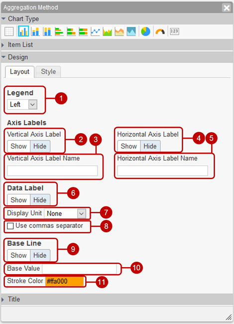
- Select the position to display the legend.
- Select whether to display the vertical axis label.
- Enter the label name on the vertical axis.
- Select whether to display the horizontal axis label.
- Enter the label name for the horizontal axis.
- Select whether to display the data label.
In case of 100% vertical stacked bar chart, 100% horizontal stacked bar chart and 100% stacked area chart, you can choose legend (series), value and/or ratio to display instead.
- Select the displayed unit of the value the data label. The value will be converted with the unit, which is none, K(ilo), M(illion), B(illion) or T(rillion).
- Enter the unit of the value of the data label.
The value is appended/prepended the entered unit such as "$" and "dollers".
- Set the digit separation (,) display of the data label.
- Select whether to display the reference line.
- Enter the reference line value.
-
Select the reference line color.
You can select from 60 colors. You can also enter the RGB value in hexadecimal.
Aggregation method: Design (style) 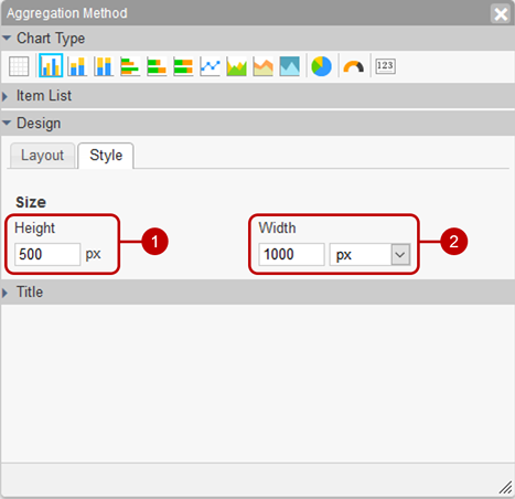
- Enter the height of the graph.
- Enter the width of the graph.
Aggregation method: Title
-
The character is decorated.
Size: Select the size of the text.
Color: You can select from 60 colors. You can also enter the RGB value in hexadecimal.
Style: You can set “bold”, “italic”, and “underline”.
-
Position to display title Select from "Left alignment", "Center alignment" or "Right alignment".
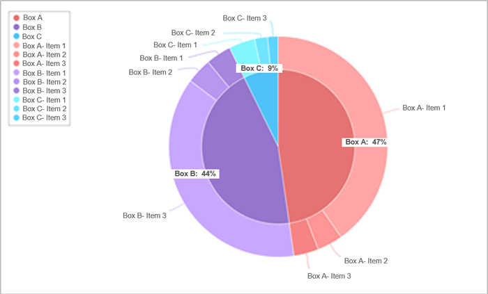
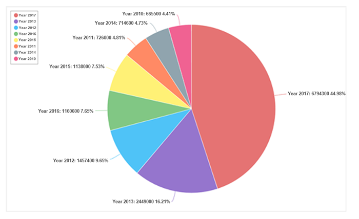
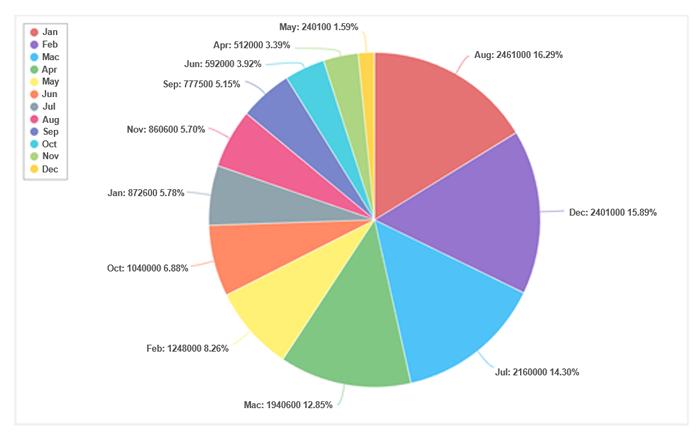
Create a pie chart
A circular figure is divided into sectors from the axes and aggregated values to show the breakdown of data and the composition ratio.
* If the aggregated value includes a minus, the graph will not be displayed.
* Pie charts can be sorted in descending order of aggregated values.
 Aggregation method: Item list
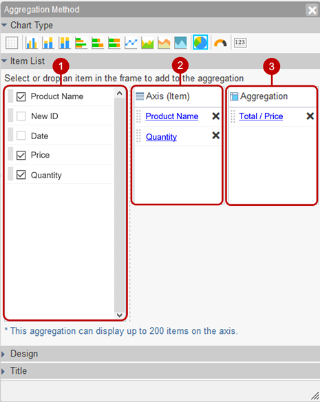
-
Select the parts to be used in the aggregation from the list.
* Text (multi line), check boxes, list boxes, table part, and reference list cannot be used for aggregation.
* select user parts are used for the first user, and select group parts are used for the first group.
* You can place a component by holding down the mouse button on the component and releasing the mouse button on "Axis (item)" “Aggregation value".
-
The parts set for the axis (item) are displayed in a list.
If you select one item, it becomes a normal pie chart, if you select two, it becomes a double pie chart, and if you select three, it becomes a triple pie chart.
-
Displays the parts that are set to the aggregated value in a list.
Axis (item) settings Settings can be made for the axis (item) parts.
Click the link of the part name to display the setting dialog.
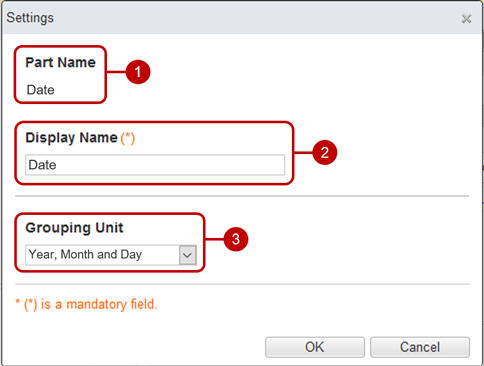
- The name of the target part.
- Enter the display name.
-
Select the unit of grouping when the part type is Date or Date/Time.
(Example) Grouping by "year"
(Example) Grouping by "month"
When the entry is complete, press "OK" button to save the data.
Setting aggregated values (calculation method) Settings can be made for the aggregated value parts.
Click the link of the part name to display the setting dialog.

- The name of the target part.
-
Enter the display name.
- Select the aggregation method.
* Method of calculation: Average, maximum and minimum cannot be selected.
-
If you want to include unfilled data in the calculation, select Treat unfilled as 0.
* If the calculation method is "Number of data", it will be set to "Count uninput".
| [Example] |
[Data |
| 100 |
| 50 |
| |
| |
|
Treat uninput as 0 |
Do not treat uninput as 0 |
| Total |
150 |
150 |
| |
|
Count unentered |
Do not count unentered |
| The number of data |
3 |
2 |
Set aggregated value (display format) 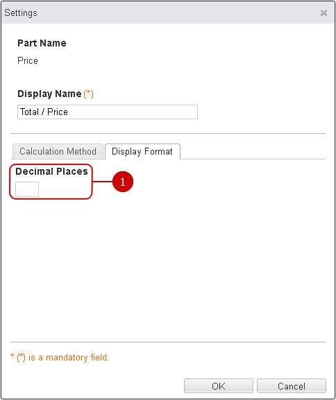
When the entry is complete, press "OK" button to save the data.
Aggregation method: Design (layout)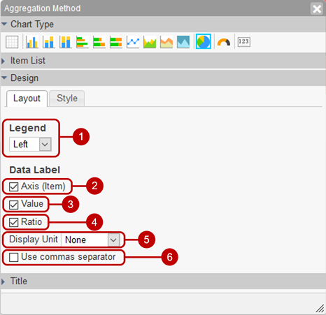
- Select the position to display the legend.
- Select whether to display the axis (item) of the data label.
- Select whether to display the aggregated value of the data label.
- Select whether to display the percentage of the data label.
- Select the alignment of the data label.
- Select the displayed unit of the value the data label. The value will be converted with the unit, which is none, K(ilo), M(illion), B(illion) or T(rillion).
- Enter the unit of the value of the data label.
The value is appended/prepended the entered unit such as "$" and "dollers".
- Set the digit separation (,) display of the data label.
Aggregation method: Design (style) 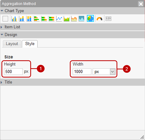
- Enter the height of the graph.
- Enter the width of the graph.
Aggregation method: Title
-
The character is decorated.
Size: Select the size of the text.
Color: You can select from 60 colors. You can also enter the RGB value in hexadecimal.
Style: You can set “bold”, “italic”, and “underline”.
-
Position to display title Select from "Left alignment", "Center alignment" or "Right alignment".
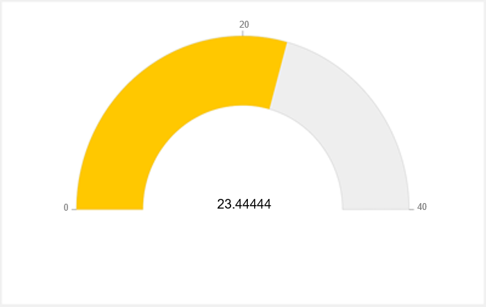
Create a gauge chart
It is a graph that represents the measurable values in a fixed range in the form of a gauge.
 Aggregation method: Item list
-
Select the parts to be used in the aggregation from the list.
* Text (multi line), check boxes, list boxes, table part, and reference list cannot be used for aggregation.
* select user parts are used for the first user, and select group parts are used for the first group.
* You can place the component by holding down the mouse button on the component and then releasing the mouse button on the "Aggregated value".
-
Displays the parts that are set to the aggregated value in a list.
Setting aggregated values (calculation method) Settings can be made for the aggregated value parts.
Click the link of the part name to display the setting dialog.
 Set aggregated value (display format)
When the entry is complete, press "OK" button to save the data.
Aggregation method: Design (layout)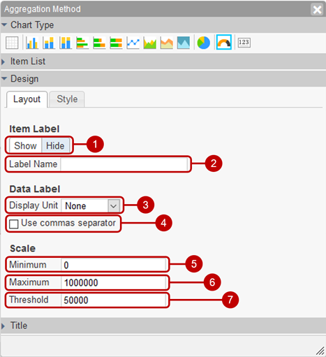
- Set whether to display the item label.
- Enter the label name of the item.
- Select the displayed unit of the value the data label. The value will be converted with the unit, which is none, K(ilo), M(illion), B(illion) or T(rillion).
- Enter the unit of the value of the data label.
The value is appended/prepended the entered unit such as "$" and "dollers".
- Set the digit separation (,) display of the data label.
- Enter the minimum scale value.
- Enter the maximum scale value.
- Enter the scale threshold.
Aggregation method: Design (style) 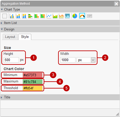
- Enter the height of the graph.
- Enter the width of the graph.
- Select the graph color when the gauge is less than the threshold.
- Select the color of the graph when the gauge exceeds the maximum value.
- Select the graph color when the gauge is between the threshold and maximum.
Aggregation method: Title
-
The character is decorated.
Size: Select the size of the text.
Color: You can select from 60 colors. You can also enter the RGB value in hexadecimal.
Style: You can set “bold”, “italic”, and “underline”.
-
Position to display title Select from "Left alignment", "Center alignment" or "Right alignment".
Create a card
The total result is expressed in the form of a card.
 Aggregation method: Item list
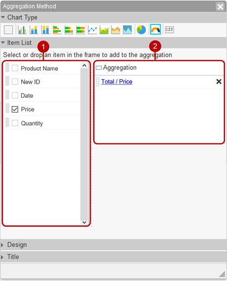
-
Select the parts to be used in the aggregation from the list.
* Text (multi line), check boxes, list boxes, table part, and reference list cannot be used for aggregation.
* select user parts are used for the first user, and select group parts are used for the first group.
* You can place the component by holding down the mouse button on the component and then releasing the mouse button on the "Aggregated value".
-
Displays the parts that are set to the aggregated value in a list.
Setting aggregated values Settings can be made for the aggregated value parts.
Click the link of the part name to display the setting dialog.
 Set aggregated value (display format)
When the entry is complete, press "OK" button to save the data.
Aggregation method: Design (layout)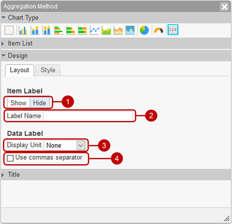
- Set whether to display the item label.
- Enter the label name of the item.
- Select the displayed unit of the value the data label. The value will be converted with the unit, which is none, K(ilo), M(illion), B(illion) or T(rillion).
- Enter the unit of the value of the data label.
The value is appended/prepended the entered unit such as "$" and "dollers".
- Set the digit separation (,) display of the data label.
Aggregation method: Design (style) 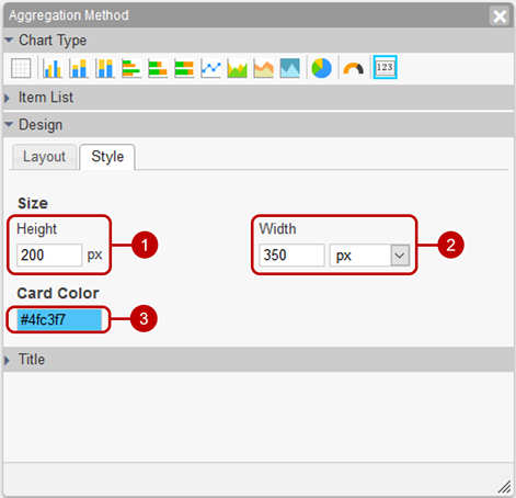
- Enter the height of the graph.
- Enter the width of the graph.
- Select a card color.
Aggregation method: Title
-
The character is decorated.
Size: Select the size of the text.
Color: You can select from 60 colors. You can also enter the RGB value in hexadecimal.
Style: You can set “bold”, “italic”, and “underline”.
-
Position to display title Select from "Left alignment", "Center alignment" or "Right alignment".
Change aggregation settings
Select the saved aggregation settings from the summary toolbar to display the aggregation change screen.
Click "Update" button to save the changes.
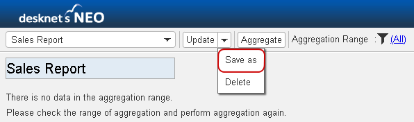
Save aggregation settings under a different name
Click the [▼] icon to the right of the [Change] button and select "Save As" from the menu that appears to display the Save As dialog box.
 Save As Dialog
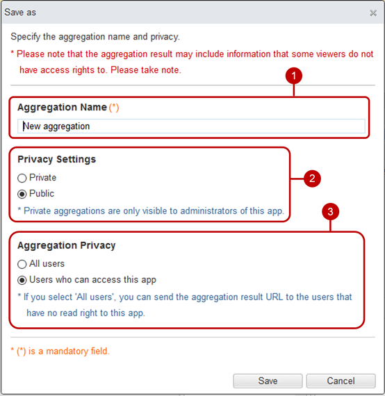
After completing all the entries, click the [Save] button to save the data.
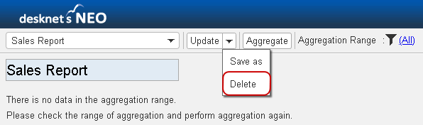
Delete aggregation settings
Click the [▼] icon to the right of the [Change] button and then click “Delete” to display the deletion confirmation dialog.
Click the [Yes] button in the deletion confirmation dialog to delete the corresponding aggregation settings. The deleted summary aggregation cannot be restored. Please be careful.
* If you delete the aggregation settings, the created aggregation results will also be deleted. Please take note.
Aggregation management
Click “Aggregation Management" in the option menu of the aggregation setting screen to display the aggregation management dialog.
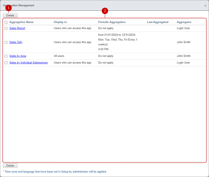
-
Delete the aggregation.
Select the one you want to delete from the list and click this button to delete it. You can also select multiple aggregation at the same time.
-
The aggregation list is displayed.
Click the aggregation name link to display the aggregation options dialog.
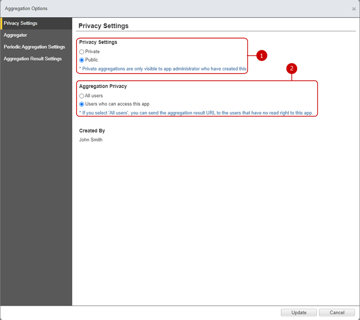
Change privacy settings
Click "Privacy Settings" in the aggregation options dialog menu to display the privacy settings.
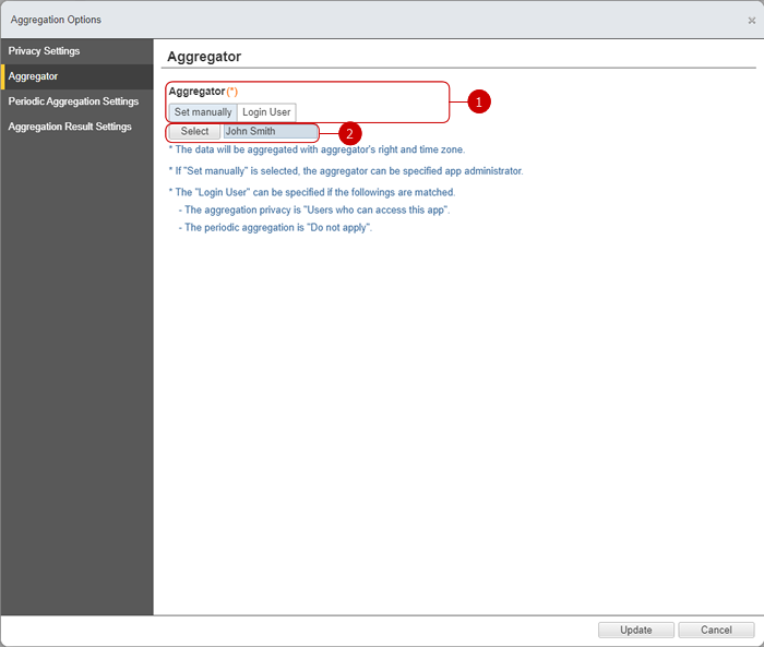
Change aggregator
Click "Aggregator" in the aggregation options dialog menu to display the aggregator.
-
Choose to specify the aggregator a manually specified user or a login user.
* Aggregations are executed on their access rights and time zone.
* "Login User" can be specified when the followings match.
- Aggregation privacy is "All users that can access to this app".
- Periodic aggregation is "Do not apply".
-
Select a aggregator.
* This field can be specified when "Set manually" is set.
* This field can be specified only app manager.
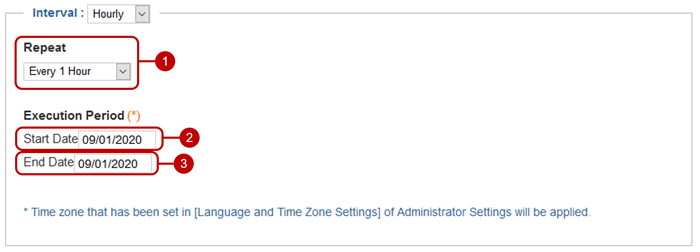
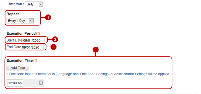
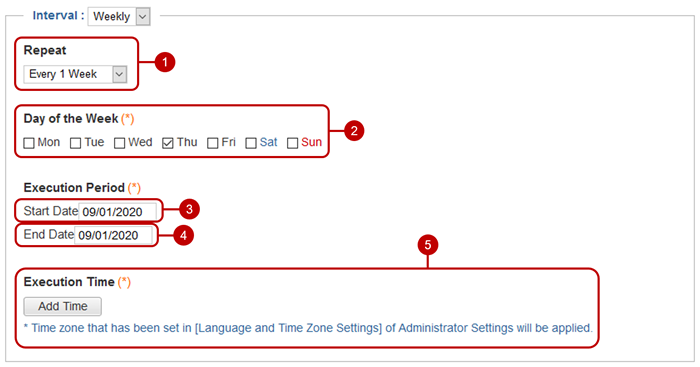
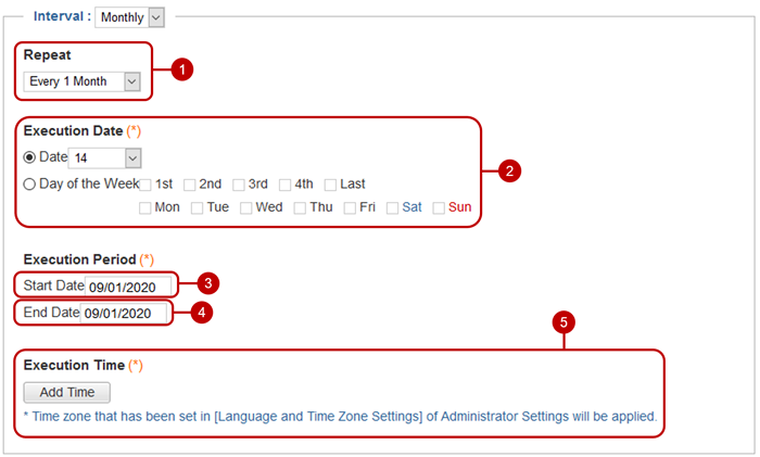
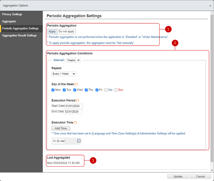
Change periodic aggregation setting
Click "Periodic Aggregation Setting" in the aggregation options dialog menu to display the periodic aggregation setting.
* To use "Periodic aggregation", desknet's NEO scheduler must be running.
Change aggregation result settings
Click "Aggregation Result Setting" in the aggregation options dialog menu to display the aggregation result settings.
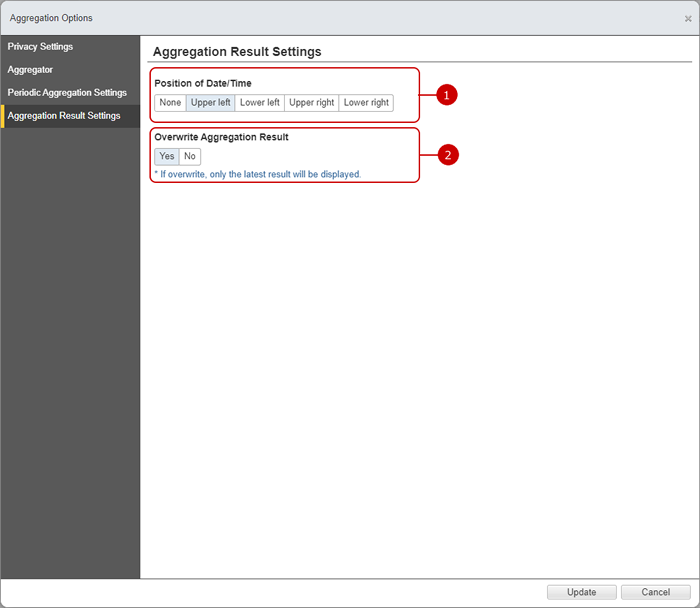
- Select the display position of the aggregation date and time.
- When new periodic aggregation result is created, select whether to overwrite the past periodic aggregation result.
When all settings are done, click the [Change] button to save the data.
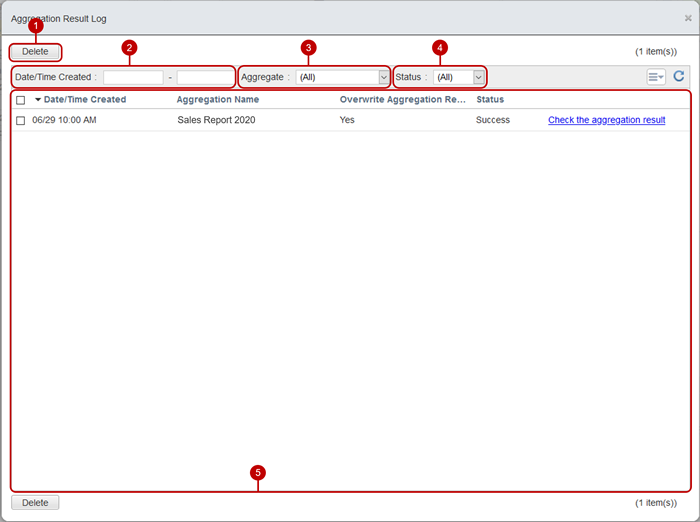
Periodic aggregation result log
Press "Aggregation result log" in the option menu of the aggregation setting screen to display the periodic aggregation result log dialog.